Explaining Alerts in 30 Seconds
MANAGER
Michael Caldwell
ROLE
Lead and independent designer
TOOLS
Figma
Adobe After Effects
OVERVIEW
How might we empower Twitch streamers to create engaging on-screen notifications for deeper audience engagement?
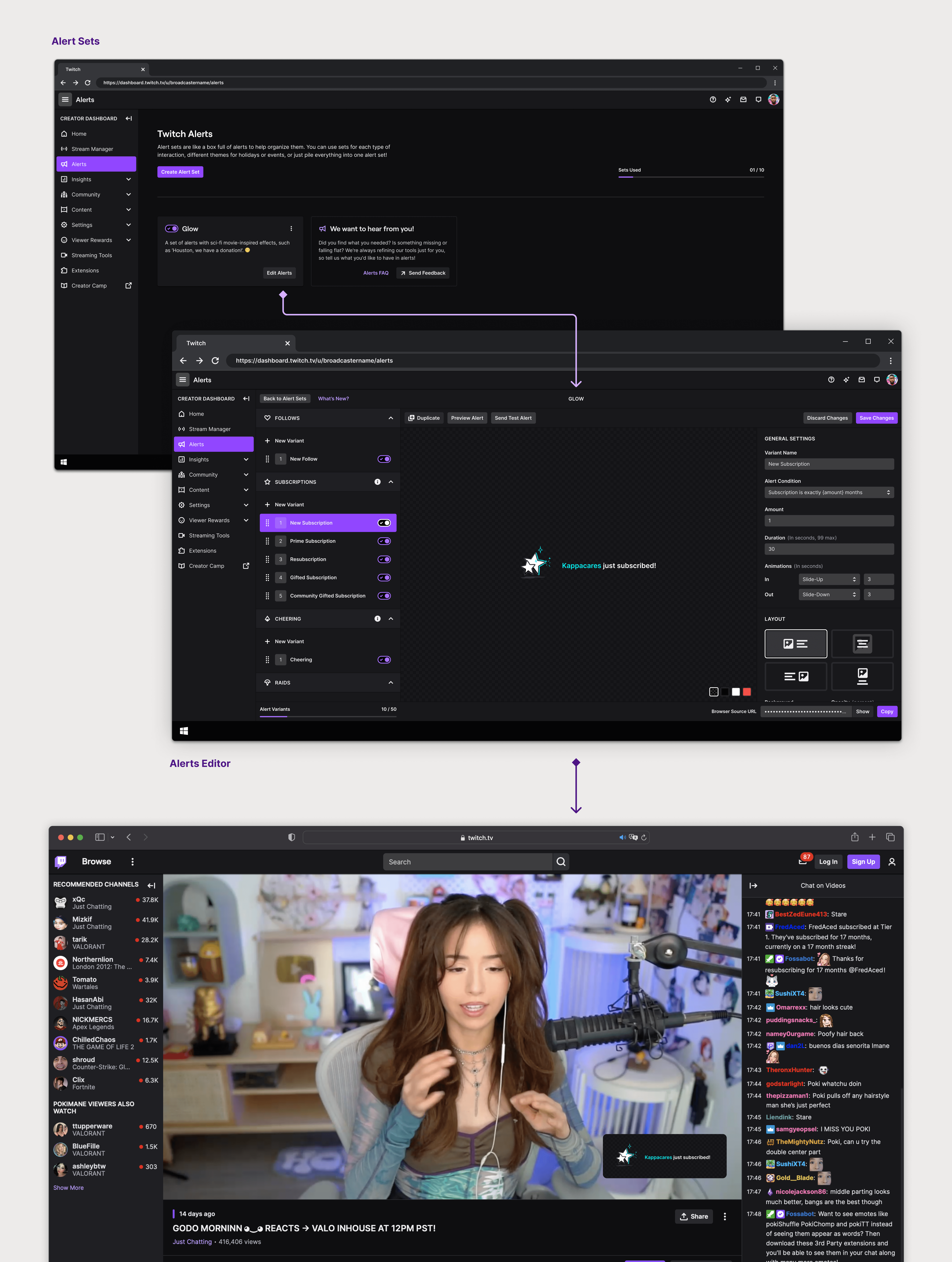
Alerts are the bread and butter for streamers to give recognition to their audience. They are on-screen notifications that appear during a Twitch live-stream informing both the streamer and the viewers of various events or activities. These alerts can take many forms, including visual animations, sound effects, and text overlays.
Previously, streamers relied on third-party platforms to create their alerts. But recently Twitch launched first-party alerts allowing streamers to create their alerts in-house. This is a very young product. I designed experiences that would help streamers understand the alerts editor, educated seasoned streamers on the unique advantages of creating in-house alerts, and welcomed new streamers with a supportive introduction to the platform.
This case study highlights how I made the alerts editor, and consequently, the overall alert creation experience friendlier to first-time users.
VISION
The main goal was to determine the most effective approach to familiarize streamers with the editor while also educating them on critical but often overlooked features.
The metaphor that I used to help guide my design decisions is that learning how to create an alert is like getting a key that opens up a door to professional streaming. But — once you have that key — you never need another one again. Instead of just explaining what alerts are in a short blurb (because we know noone reads), I tried to find ways to bake the concierge into the experience.
PROBLEM SPACE
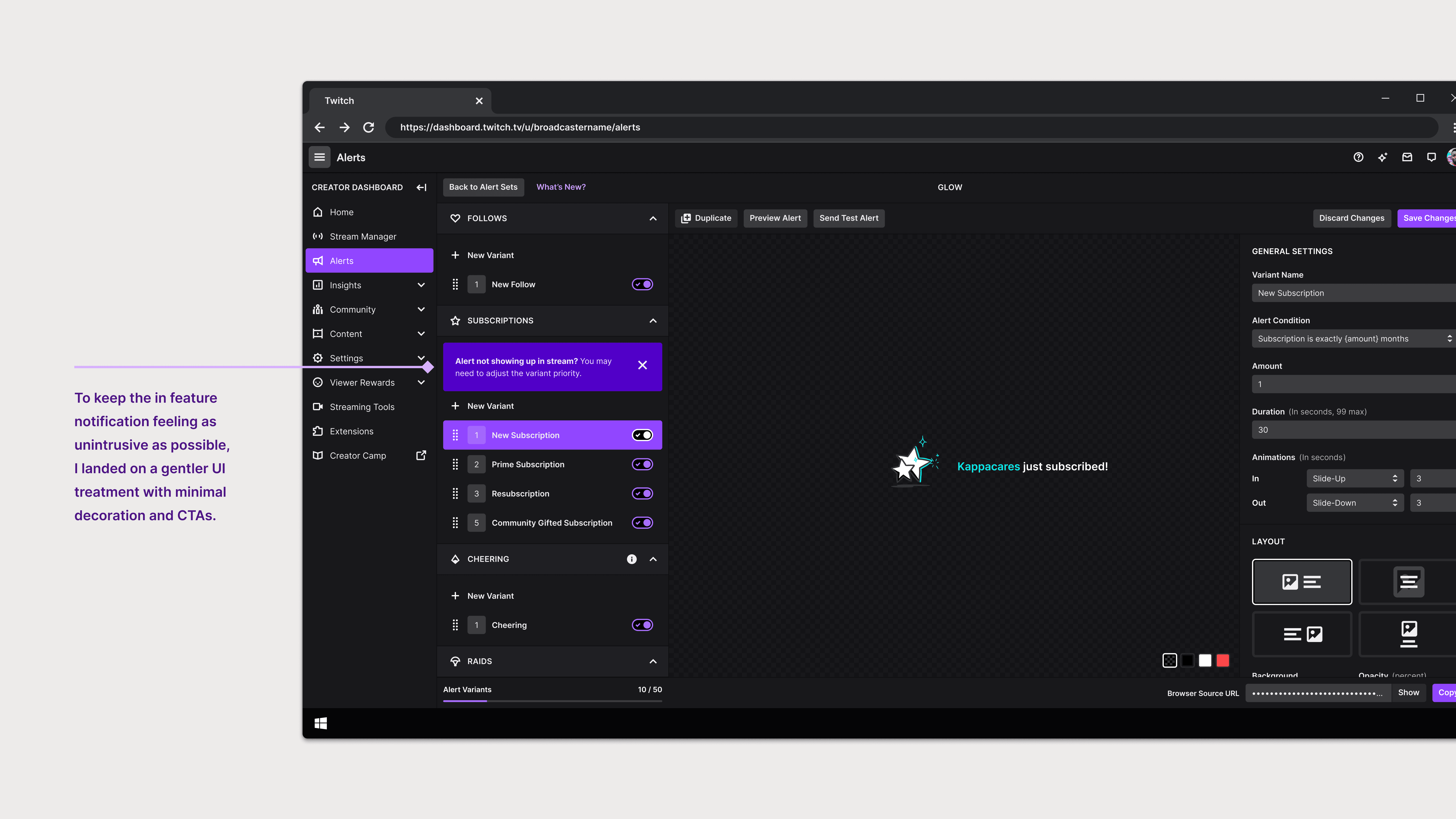
Streamers struggled to grasp the significance of certain features in the alert editor
Consulting our user research revealed that the placement and functionality of the browser source, along with variant priority, were clouding the editor experience, both of which are critical steps for streamers to create alerts.
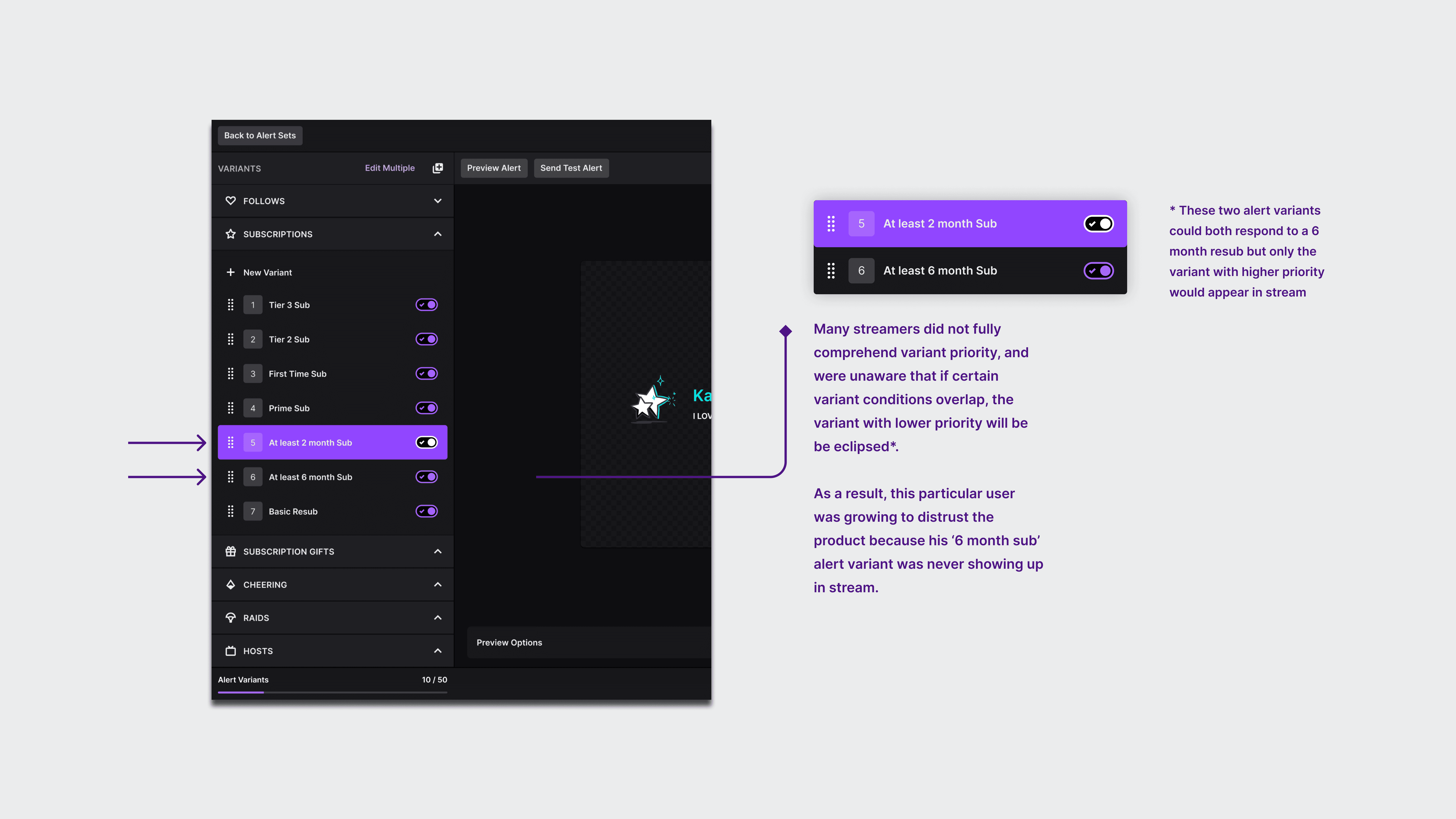
Real example of a common pitfall our streamers experience with variant priority
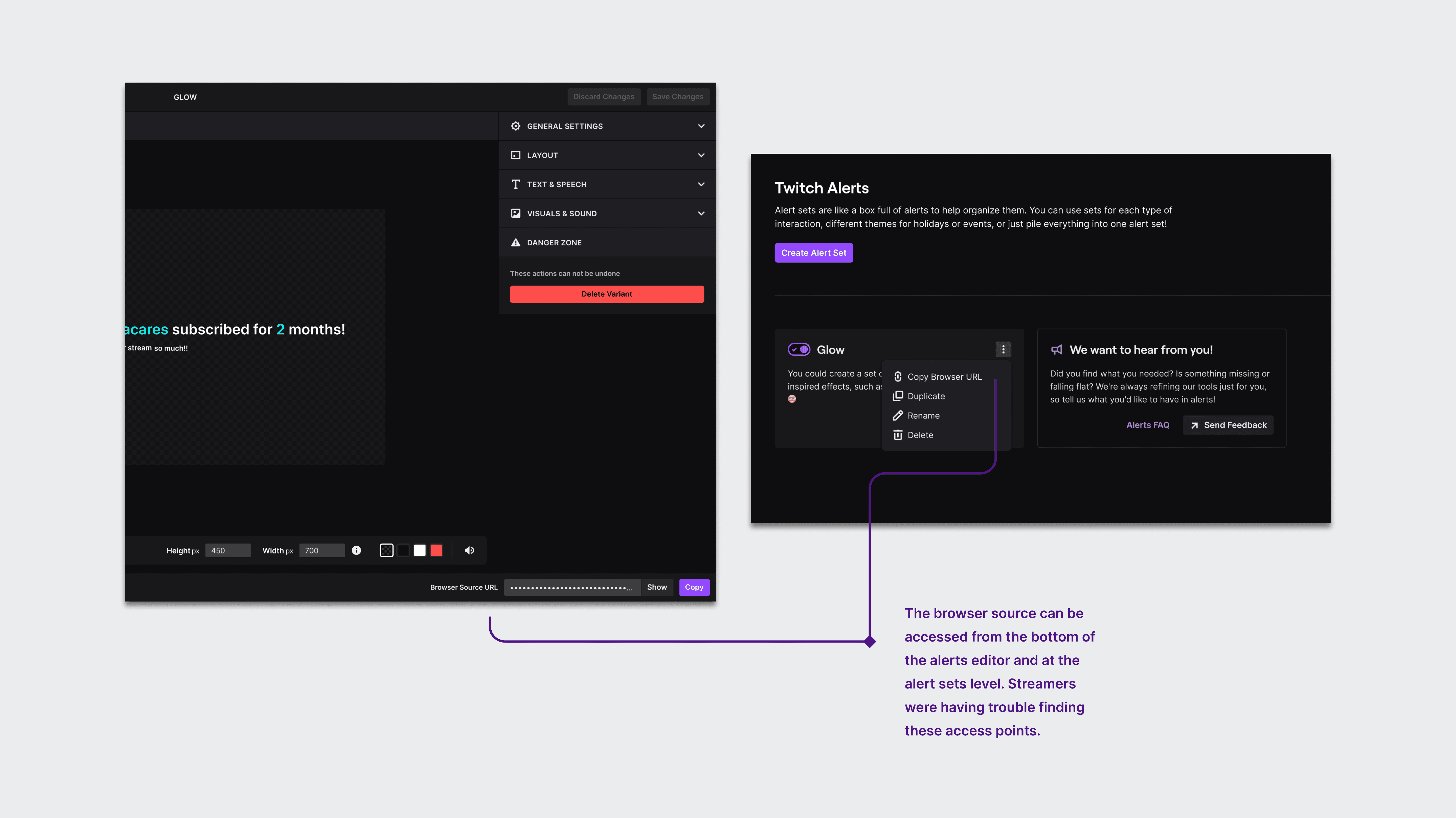
Another common pitfall for streamers was finding the browser source
UX FRAMEWORK
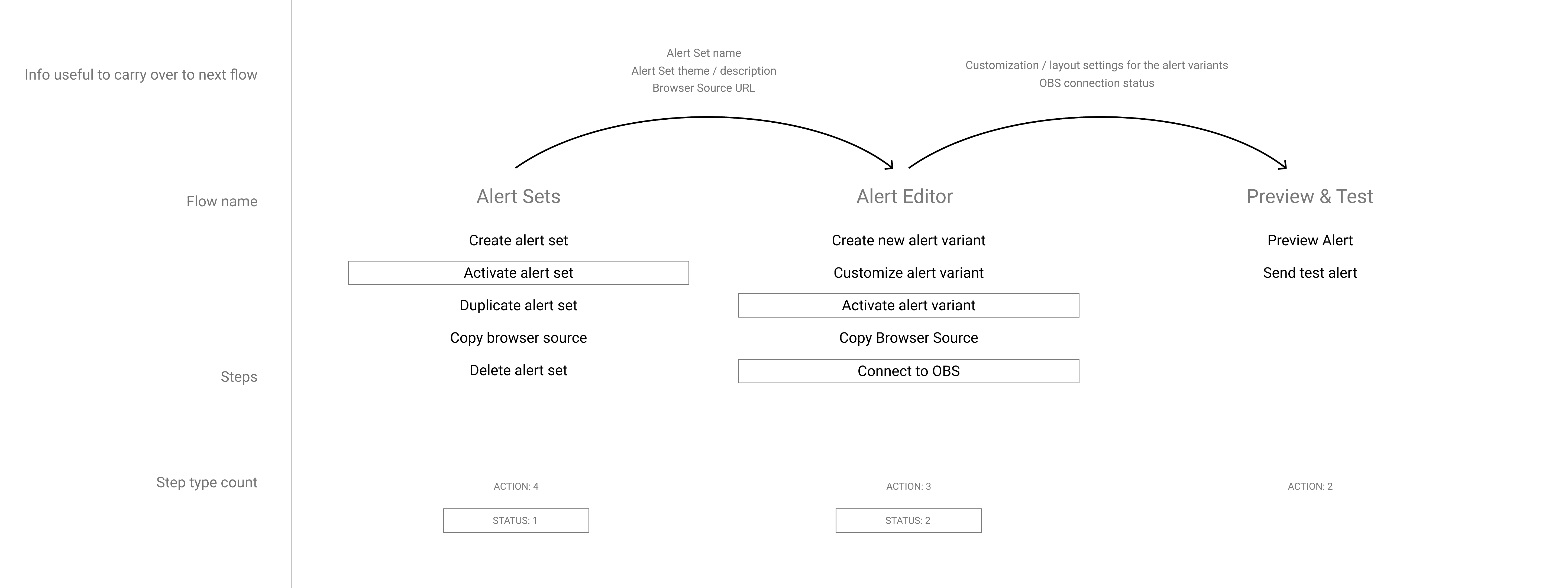
I found clarity by breaking down the necessary steps and key components needed to create an alert.
From this I was able to identify the mechanics of the process. My aim was to look for "gold nuggets" — crucial aspects of the alert creation process that required additional context and were essential for the streamer to comprehend.
EXPLORATIONS
I set off to create different types of first-time user experiences based on the level of invovlement required from the streamer.
I presented three ideas: a product tour, a checklist with progress indicators, and a step-by-step guided tutorial. Creating alerts is an inherently creative process, lacking a strictly prescribed method. Therefore, we chose a walkthrough approach that highlights the key aspects of the editor. This empowers our creators, giving them the confidence to explore and unleash their creativity with the necessary knowledge of the essential features.
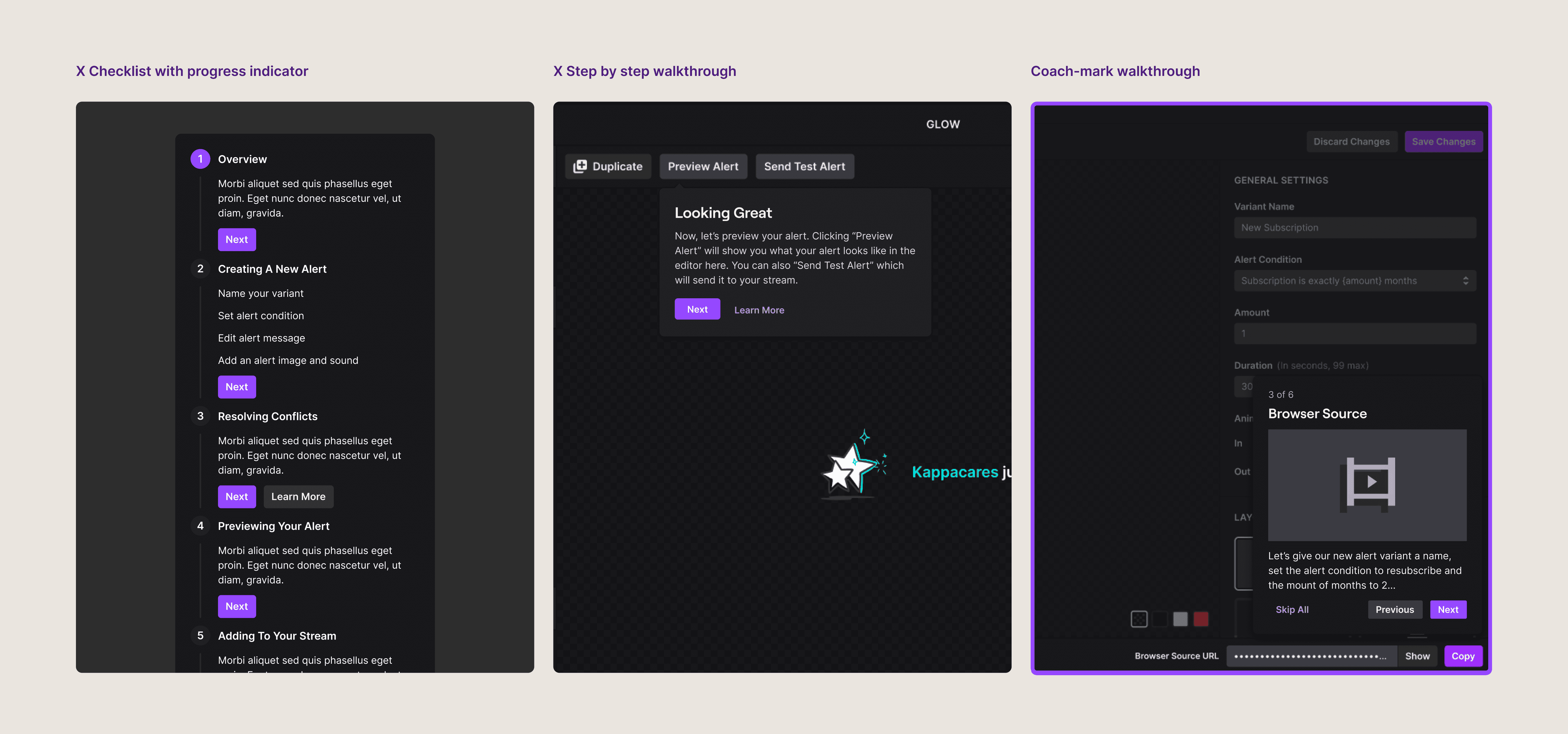
There were a couple other blue-sky ideas we had for the first time user experience. I'm happy to share those explorations too.
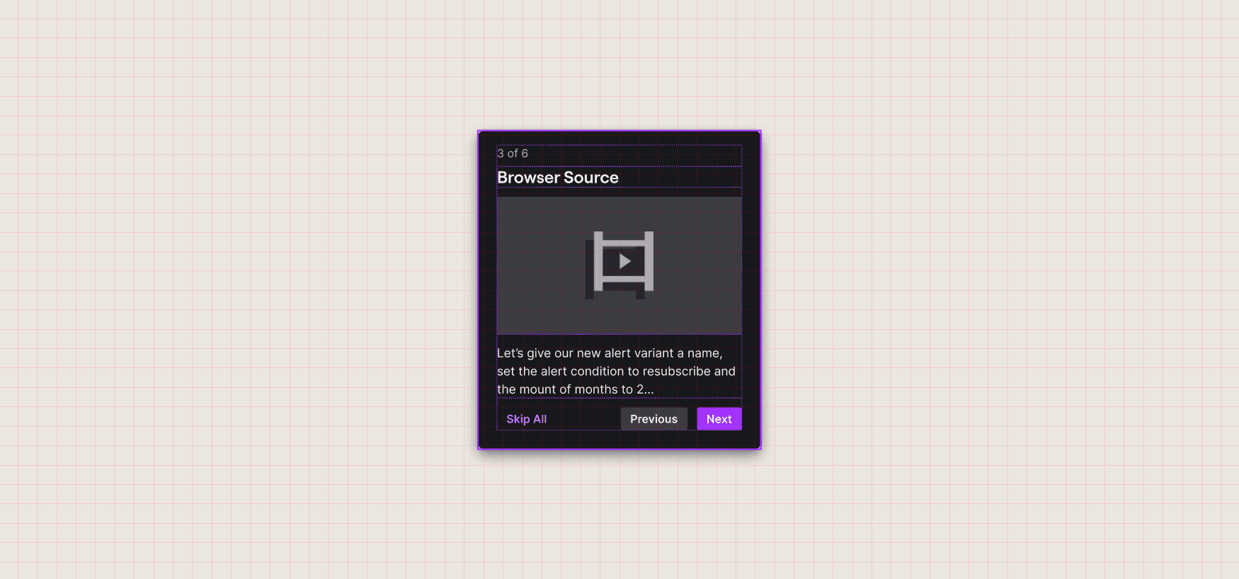
MOTION ASSETS
With the approach approved, we started working on developing motion assets for each of the coachmarks. This took a lot of visual exploration and a self-led design jam with the Core UI team.
Once I identified the content within each coachmark, I led a brainstorming session to sketch out different motion concepts. Throughout the process, we prioritized simplicity, product localization, and clarity — arriving at a set of motion assets that effectively conveyed the desired information and were consistent with the overall look and feel of the product.
Our aim was to design an opening visual that not only captured attention but also effectively communicated the functionality of alerts.
I focused on using simple shapes and smooth motion curves to convey complex ideas
REFINING THE INITIAL VISION
After finalizing the motion assets, I paused to evaluate the overall experience and addressed the product knowledge gaps that were brought up initially.
There were three problems left to tackle: helping streamers understand variant priority, reminding streamers to copy the browser source, and devising a mechanism to guide users when new updates are pushed to the editor. Although the first time user experience offered some relief to these challenges, a more sustainable solution was necessary to address these ongoing issues.
Reactive in-feature notifications used to help streamers understand variant priority in a "learn by doing" manner
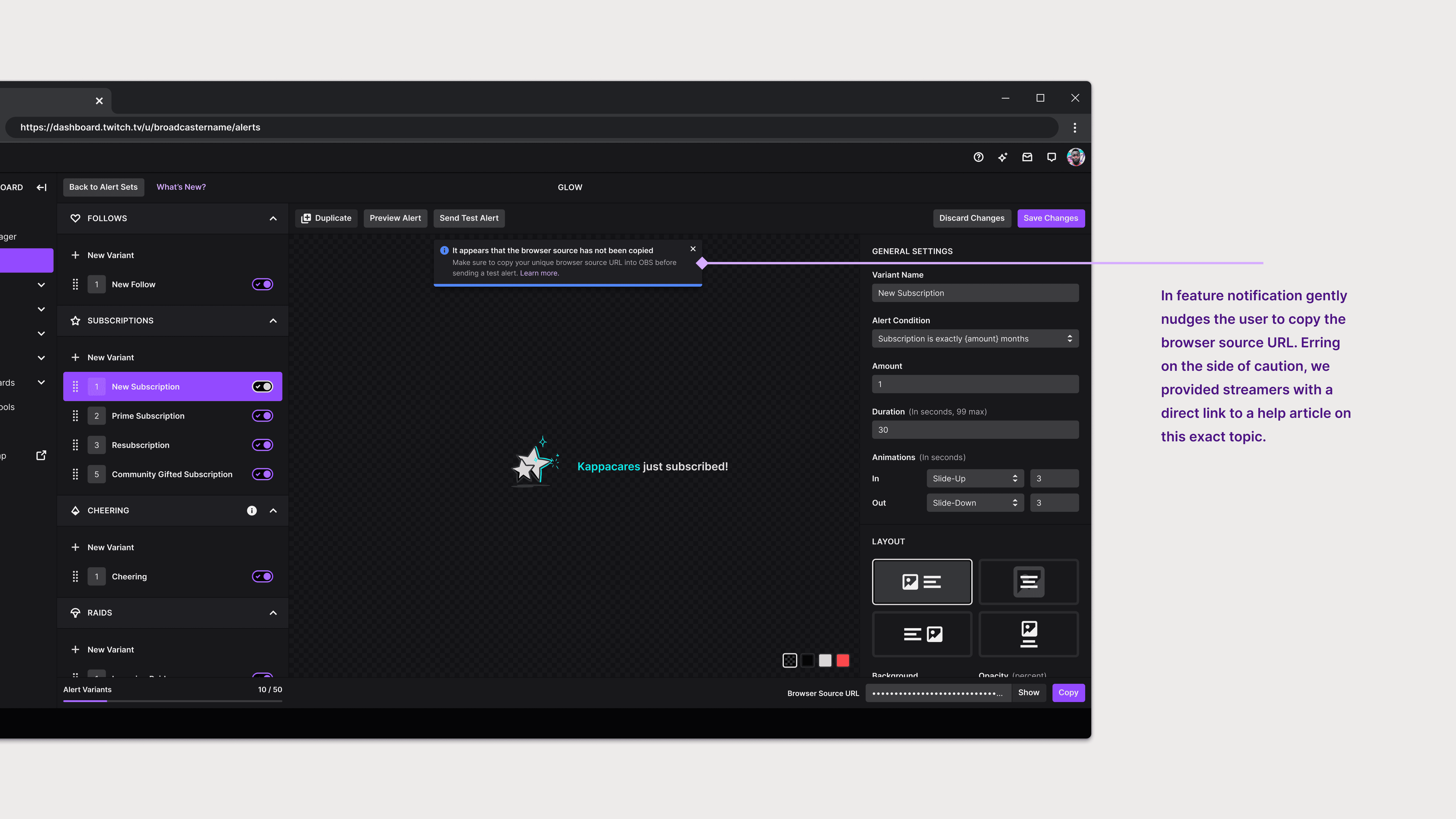
In-feature notification appears after a streamer presses 'Send Test Alert' but has not yet copied their Browser URL
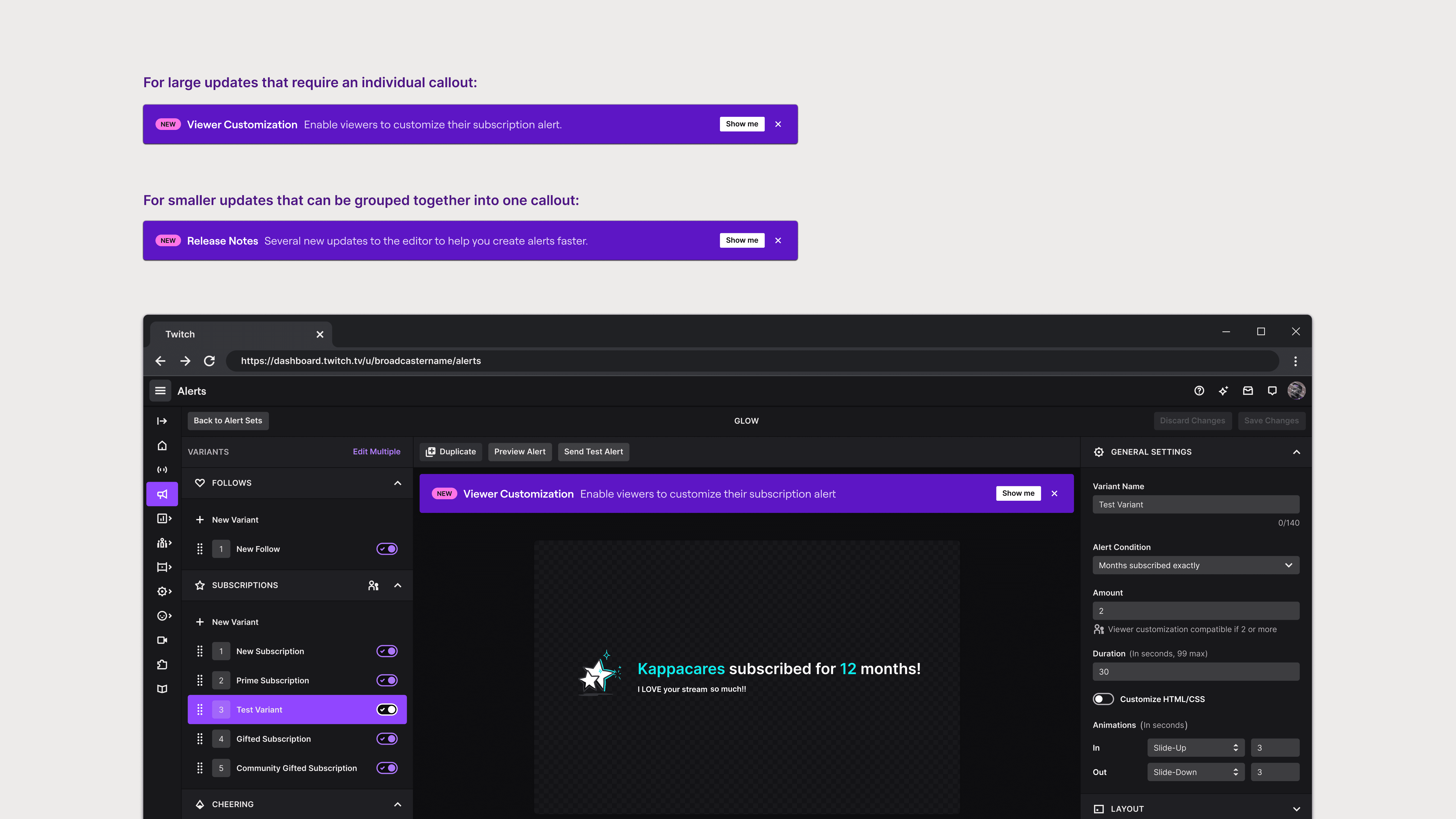
Callouts for when we're ready to deliver the good stuff to our beloved streamers
FINAL THOUGHTS
The next steps involve testing the approach we took and iterating upon the experience with user research.
My time at Twitch was short but sweet. I would have loved to continue what I started but I know that I left my work in good hands.
My biggest takeaway from this project was navigating the human dynamics involved in getting buy-in from relevent stakeholders. This project required me to work with Product, Engineering, Data Science, and Marketing. As the sole designer, this involved persuading people who have different priorities and perspectives and getting them all to see eye to eye. It was a delicate balance of diplomacy, communication skills, and having a clear and compelling vision for what Design was proposing.