Behind The Numbers
OVERVIEW
The 2020 census is a decennial population count conducted by the United States Census Bureau to collect and gather data on the current population of the United States. It's easy to get caught up in the magnificence that is the data itself, the magnitude of it.
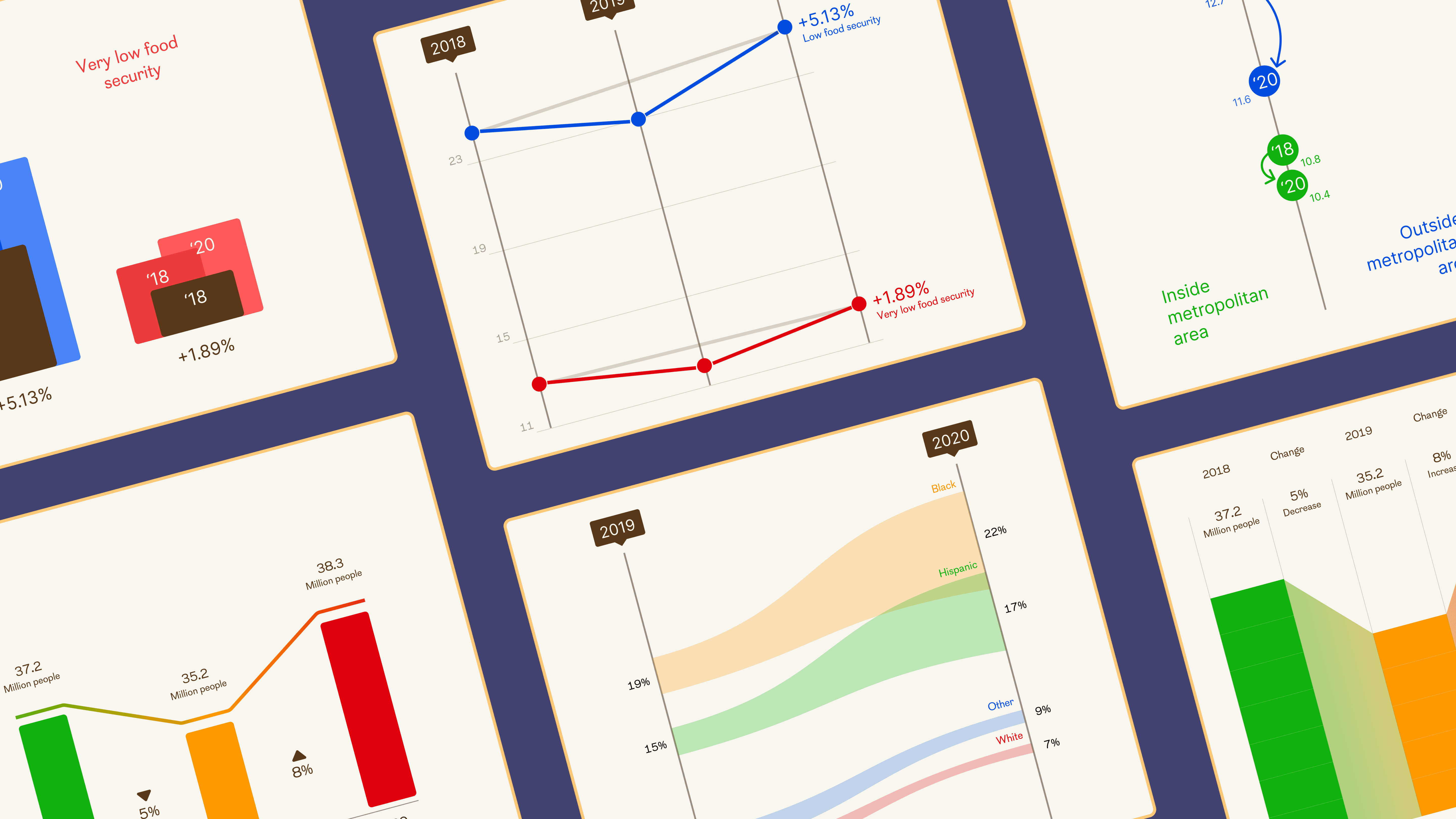
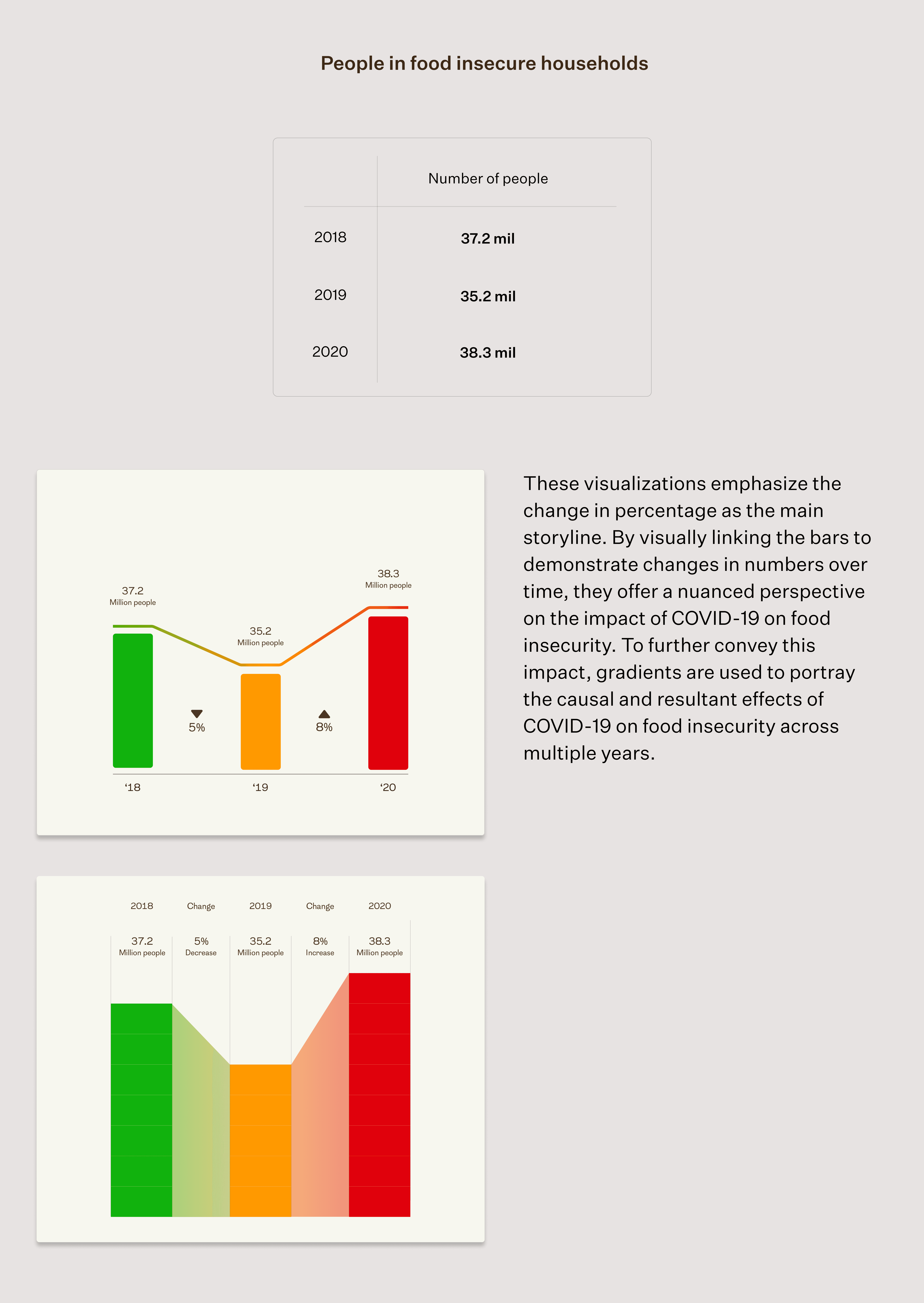
Using data from the 2020 Census, this project aimed to shed light on the effects of COVID-19 on food insecurity in the United States. The resulting visualizations and interactive site highlight broad trends and patterns but also attempt to capture the lived experiences and personal stories of individuals and communities impacted by food insecurity.
PROBLEM SPACE
How do you tell stories that convey the human element of data?
This project ultimately became an investigation into how and why certain data was pulled and built. We combined open federal data with personal narratives and testimonials to provide a more comprehensive understanding of the issue of food insecurity and reveal the unique challenges faced by different communities.
QUANTITATIVE DATA
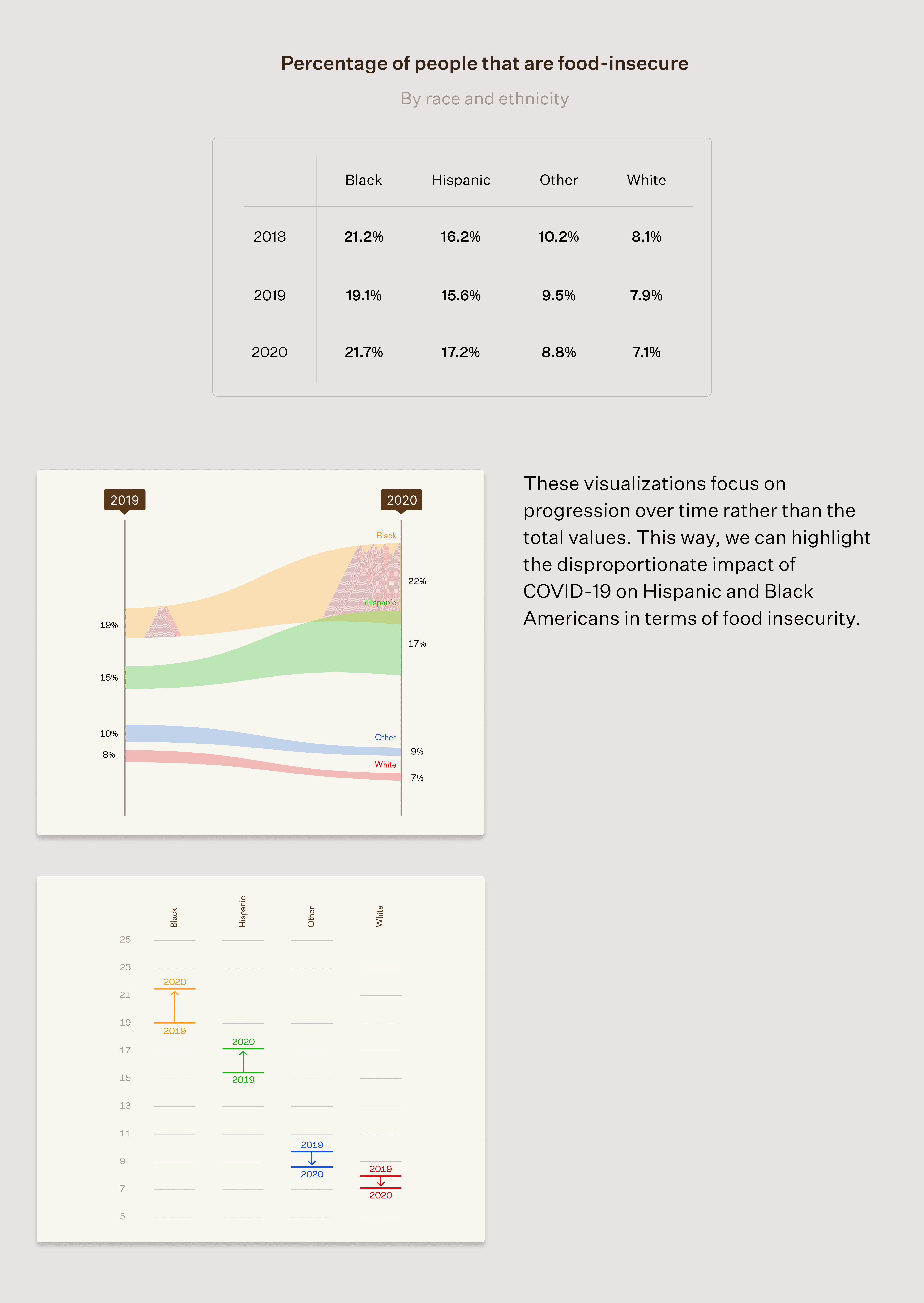
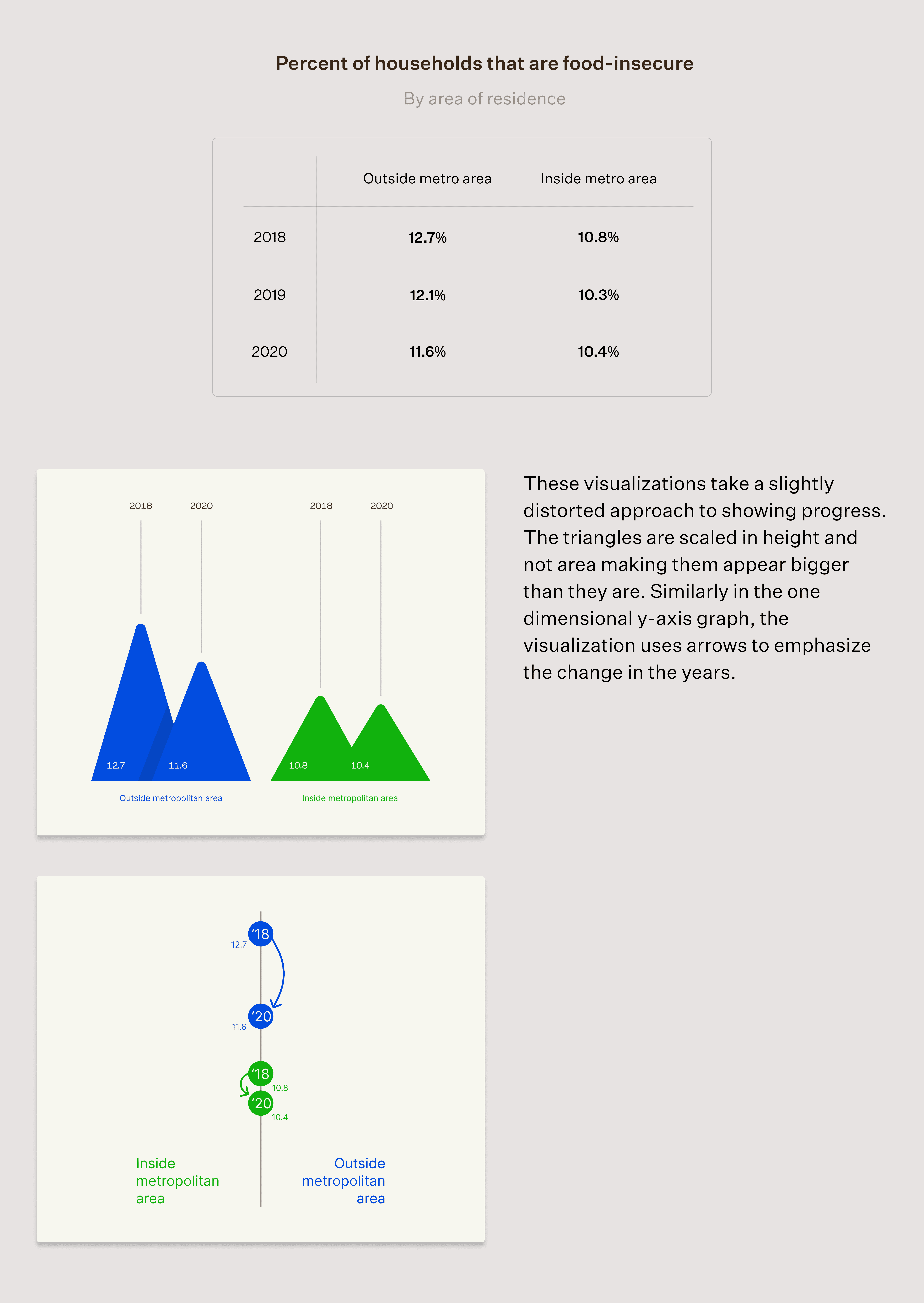
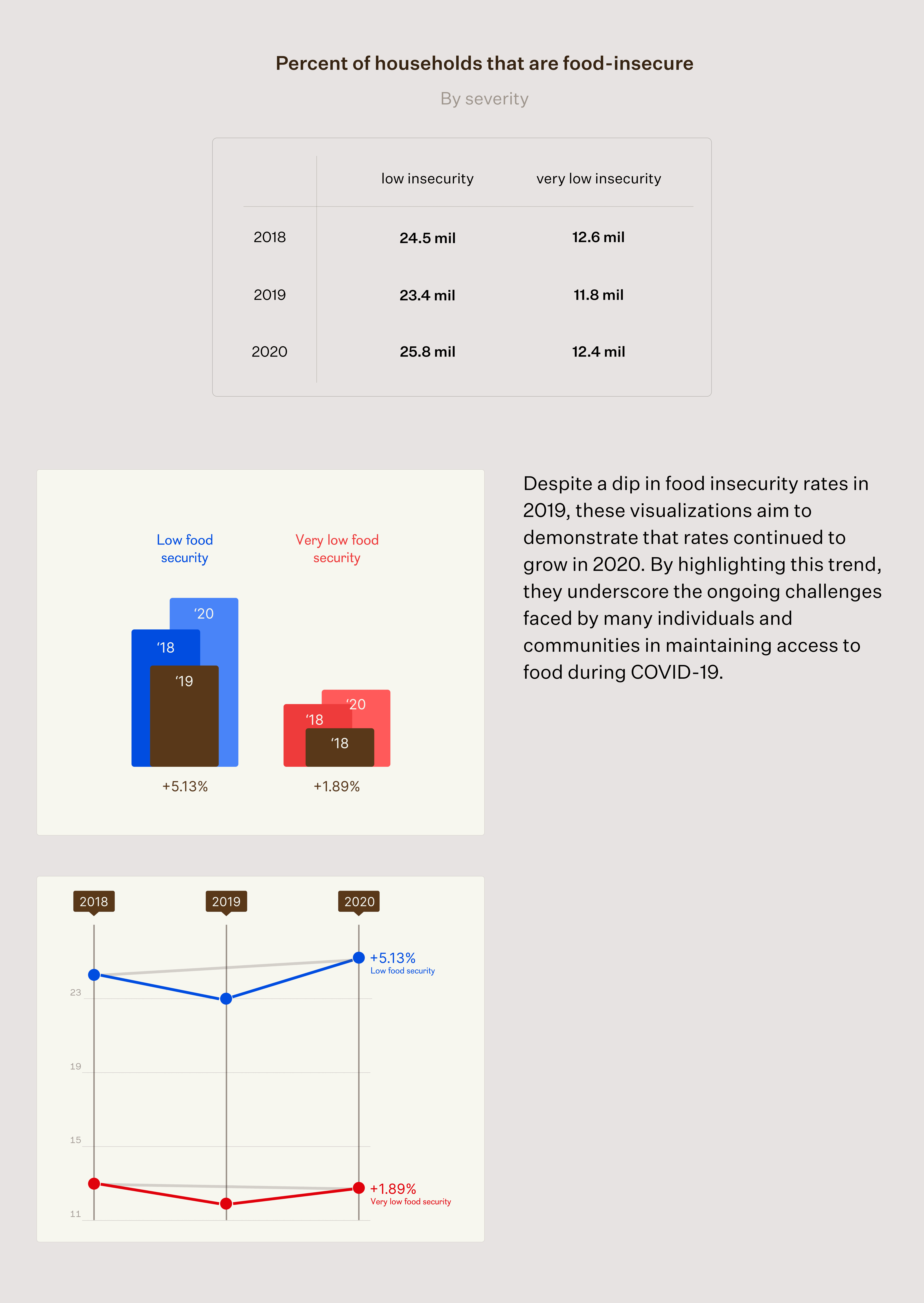
I created eight visualizations from four data sets. In these explorations I made sure to balance narrative and data integrity.
The challenge I faced was finding a balance between the narrative of a visualization and the integrity of the data. There were times when I had to pause and rethink my designs to ensure that the data wasn't manipulated or misrepresented to fit a particular narrative. It was crucial to strike the right balance between telling a compelling story and staying true to the data.
QUALITATIVE DATA
The website prototype provides a platform for sharing and exploring lived experiences that data alone cannot fully convey — highlighting the human impact of the issue at hand.
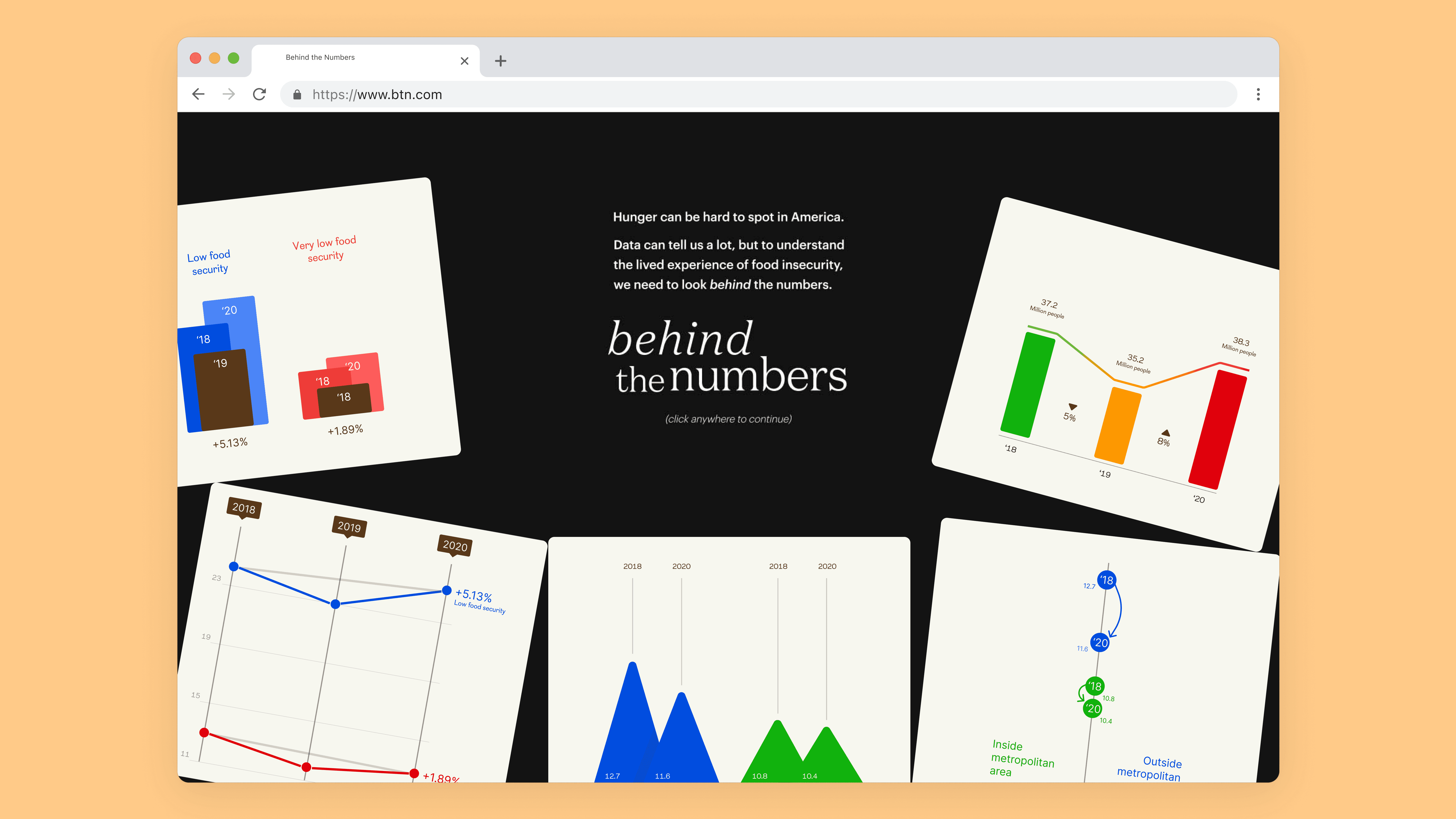
The landing page aims to use data to provide a nuanced perspective on the issue, emphasizing the need to look beyond the numbers to gain a deeper understanding. To achieve this goal, it intentionally presents a wealth of information designed to "overwhelm" the user with insights and encourage further exploration.
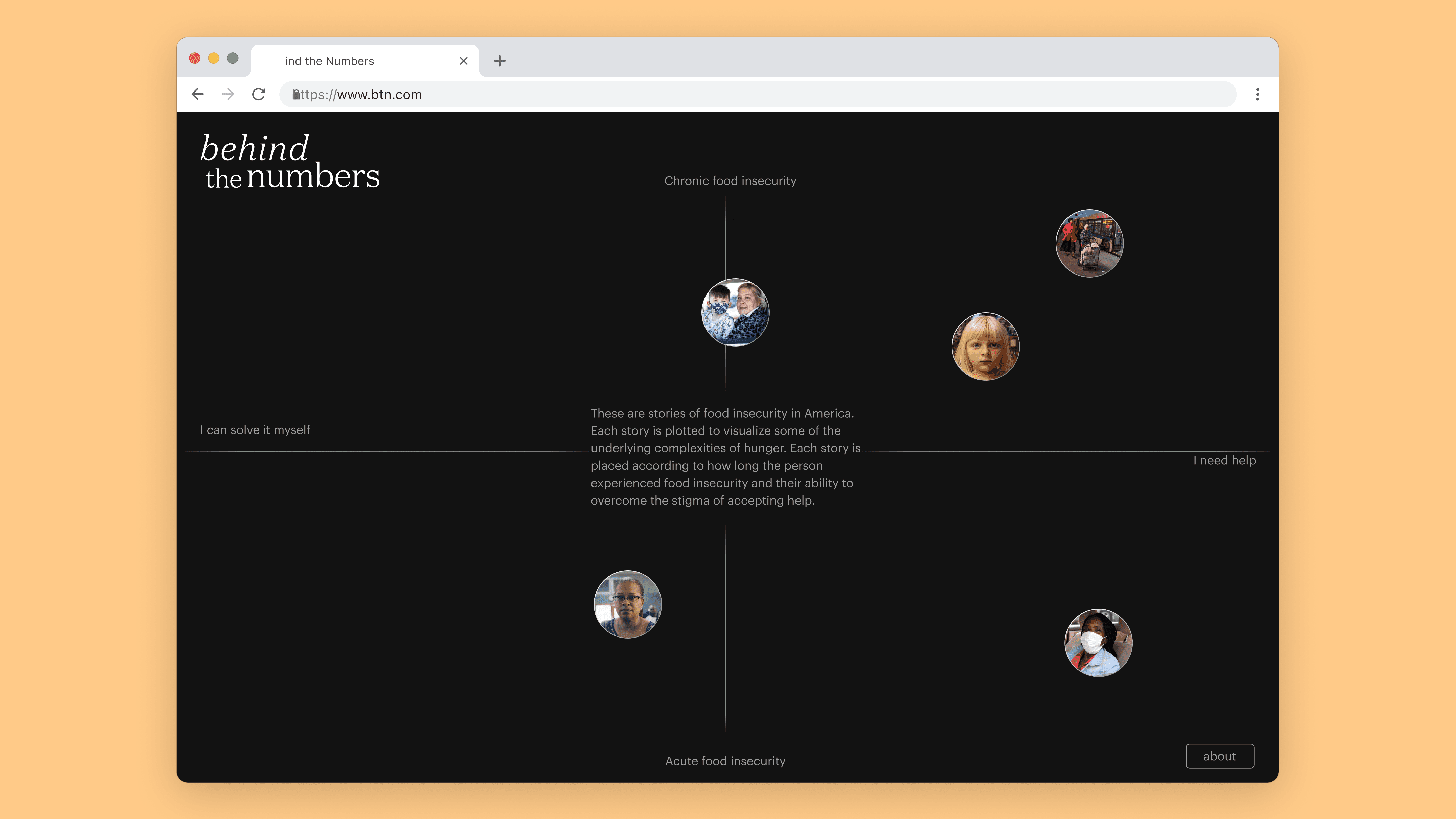
The landing page opens up to a matrix. Placing lived experiences and narratives on one page that viewers can browse.
The landing page
The matrix
CONCLUDING THOUGHTS
This exercise in visualizing data has taught me to pay more attention to the nuances of design.
The process of transforming raw data into a visual form requires careful consideration of every element, from color and typography to layout and composition. I learned that visualizing data also requires a deep understanding of your audience. By understanding your audience, it allows one to tailor the visual representation to the intended audience, providing them with the right context and insights.

