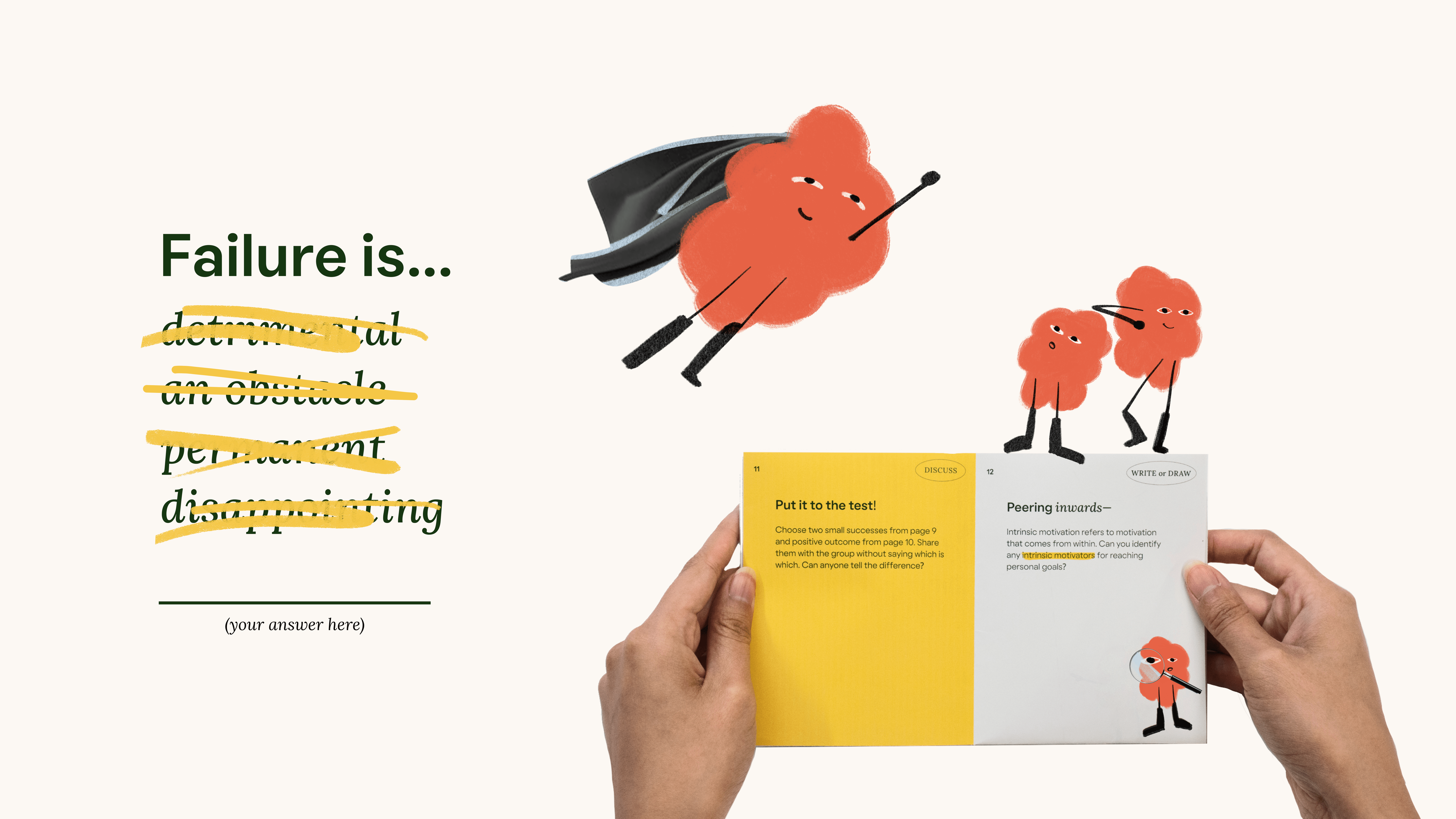
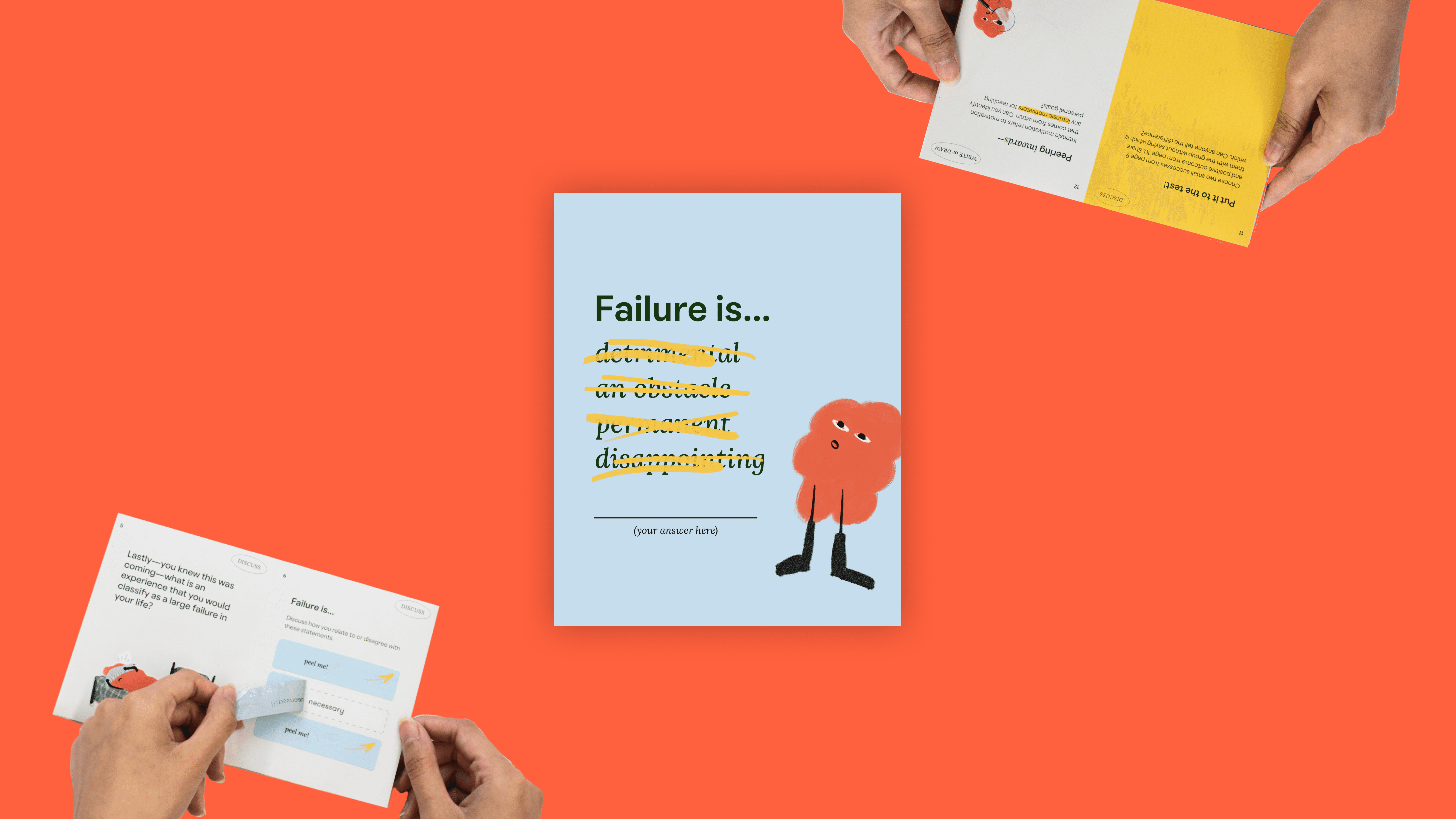
Failure Is…
TEAM
Andrea Benetar
Sophia Fan
ROLE
Designer / Developer
OVERVIEW
How might we design a learning experience that reignites the innately human drive for exploration, growth, self-worth, and lifelong learning?
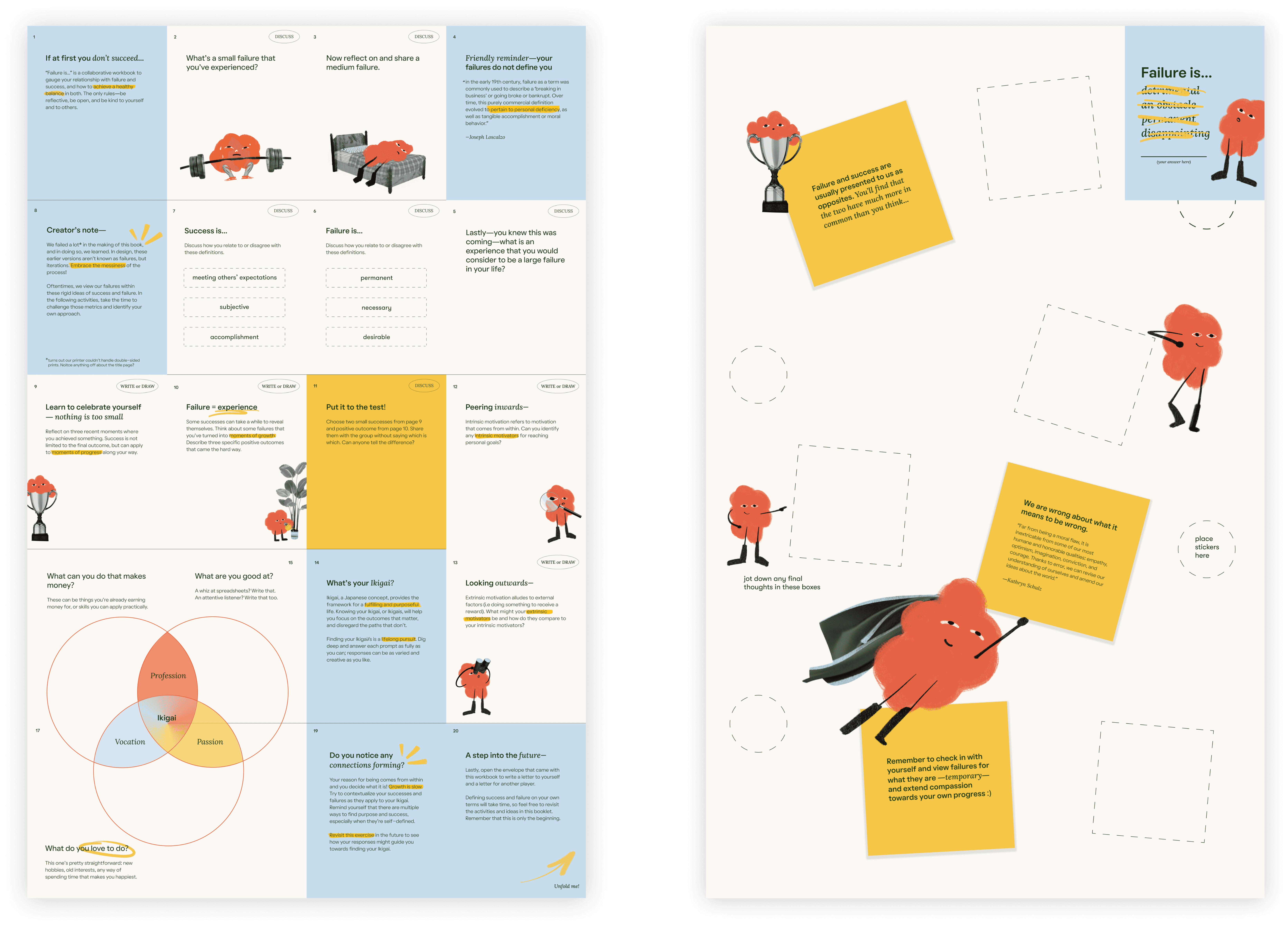
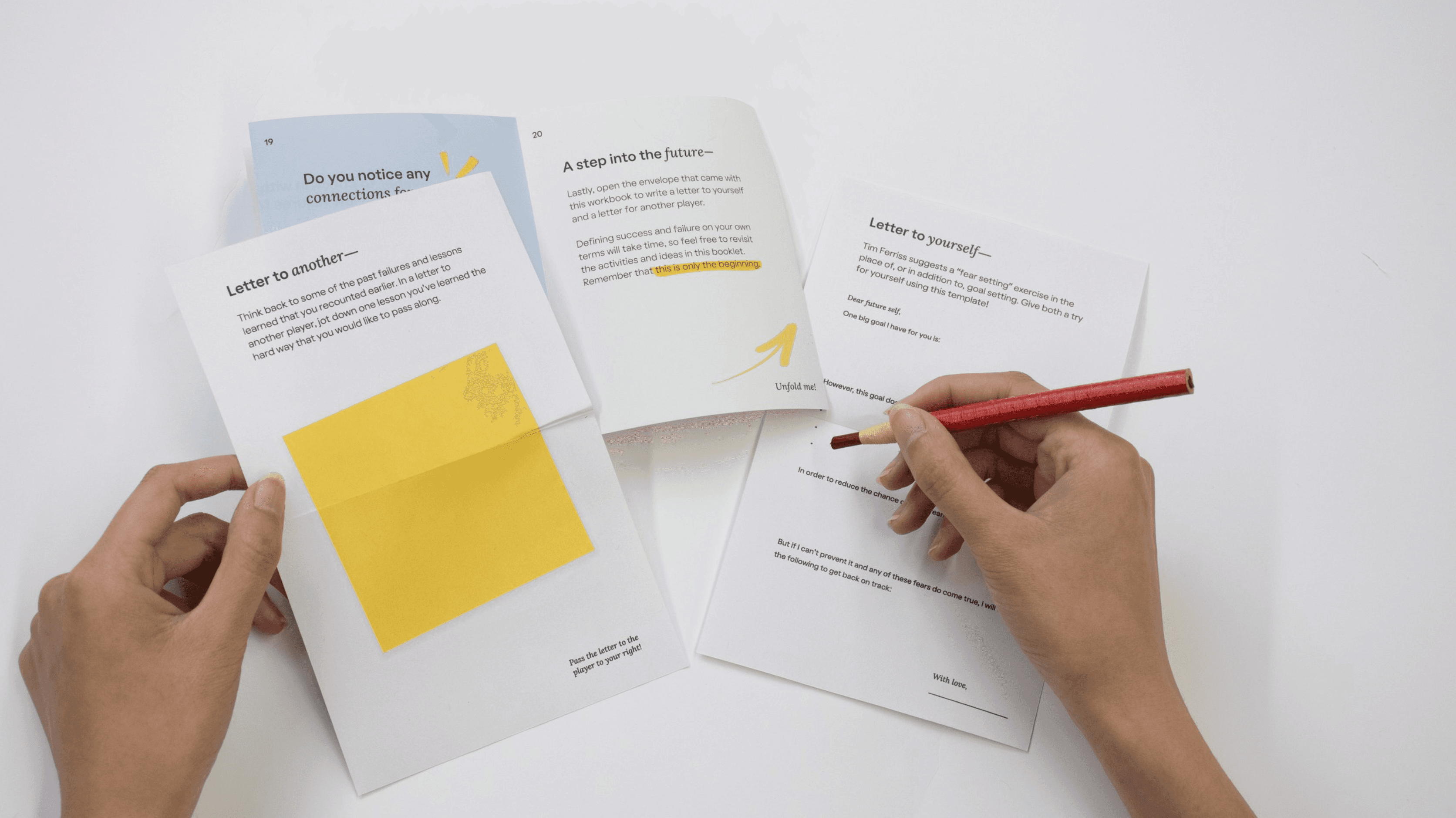
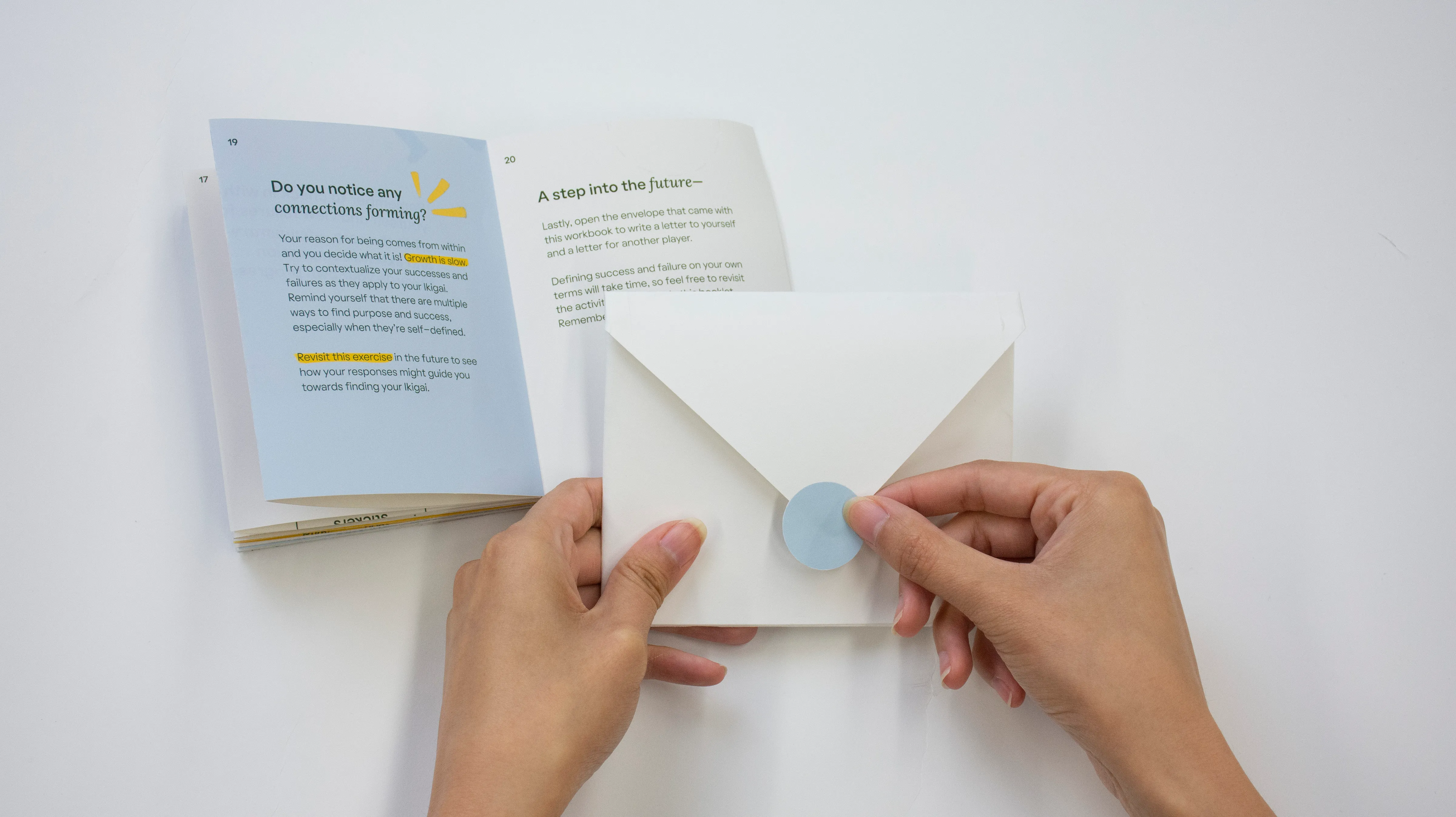
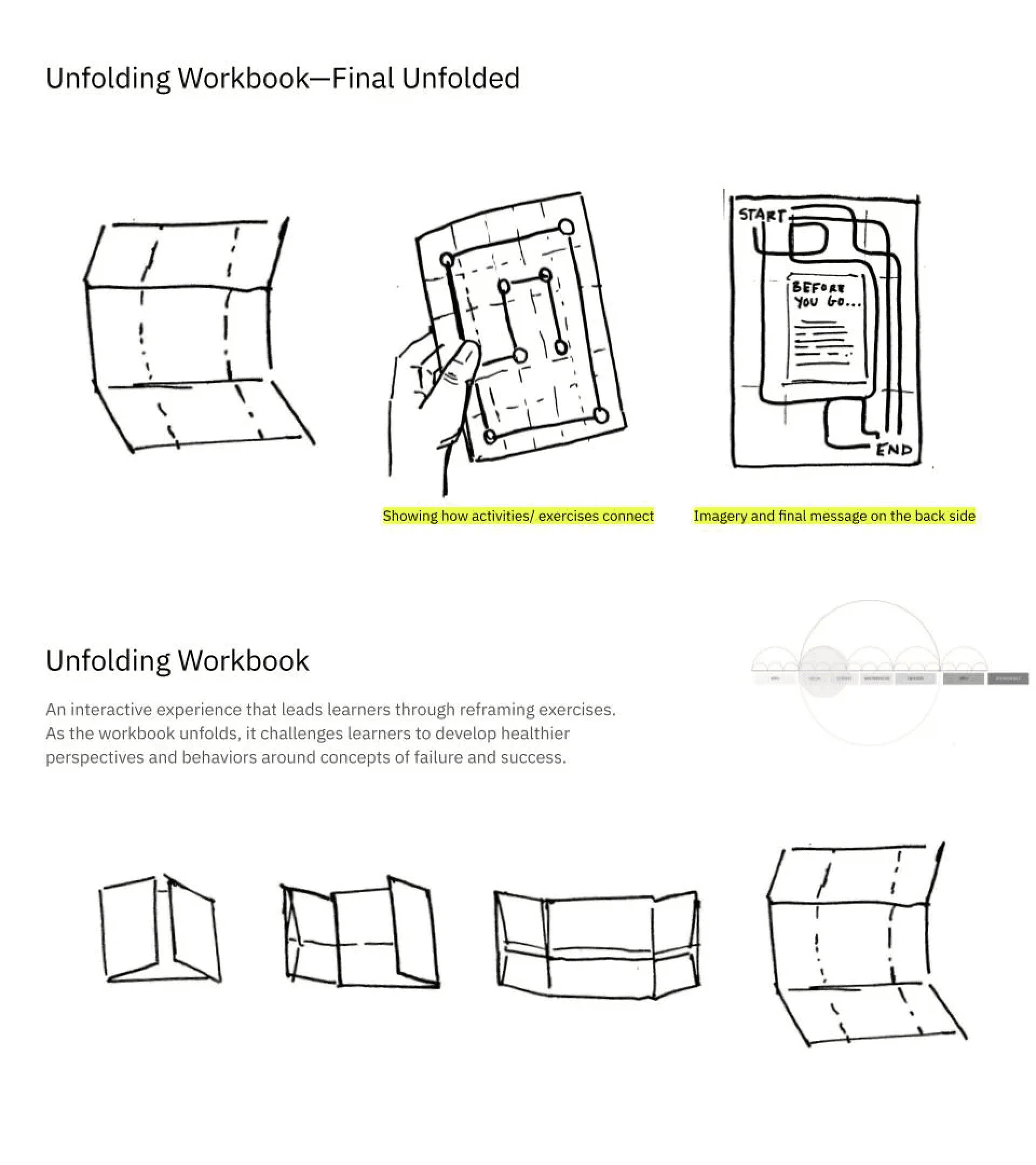
The final outcome is a workbook + interactive website that learners flip through and engage in reflective and interactive activities ultimately being able to see their growth over a short period of time.
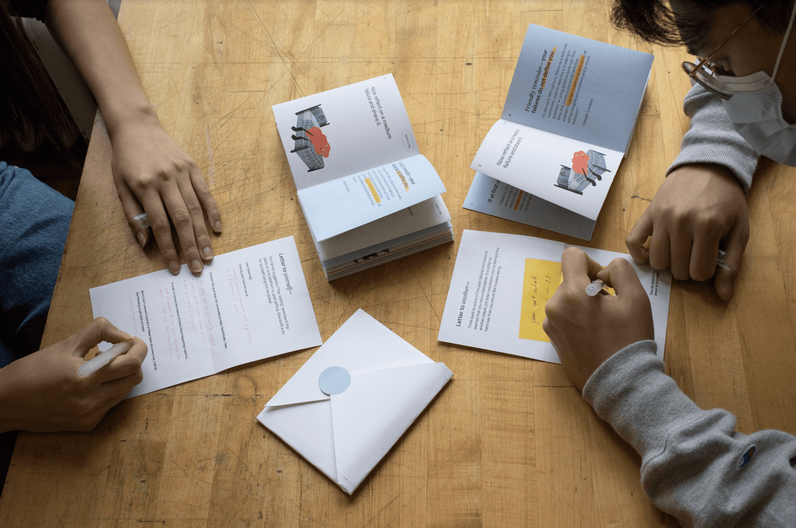
This book is one of my favorite projects because it offers a tangible experience. Most of my design work is digital, and while these digital projects require the same amount of meticulous attention, only a physical object carries an inherent sense of authenticity and comprehensibility.
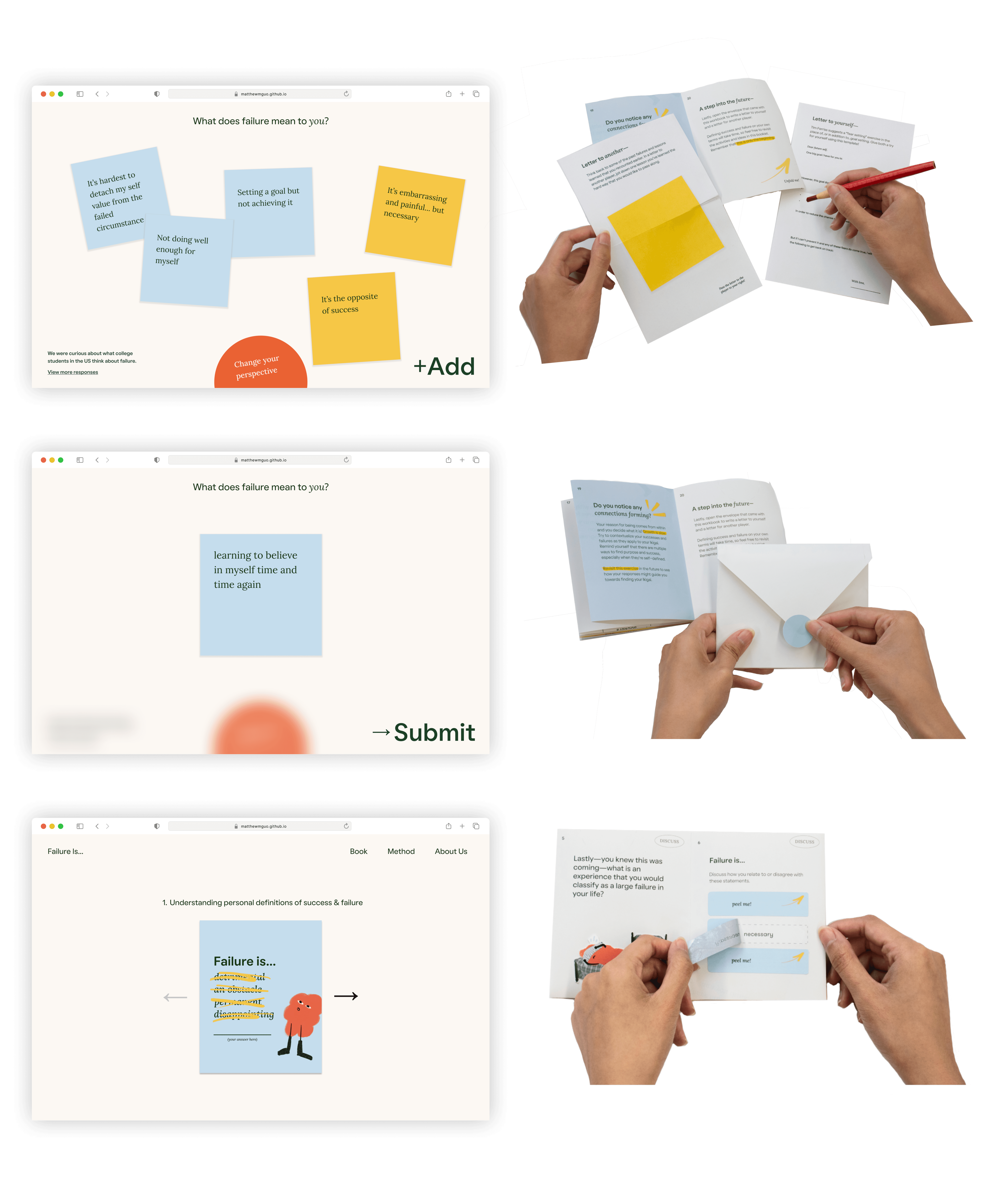
Site + book — a unified system
The workbook was designed to be experienced in groups or pairs
PROBLEM SPACE
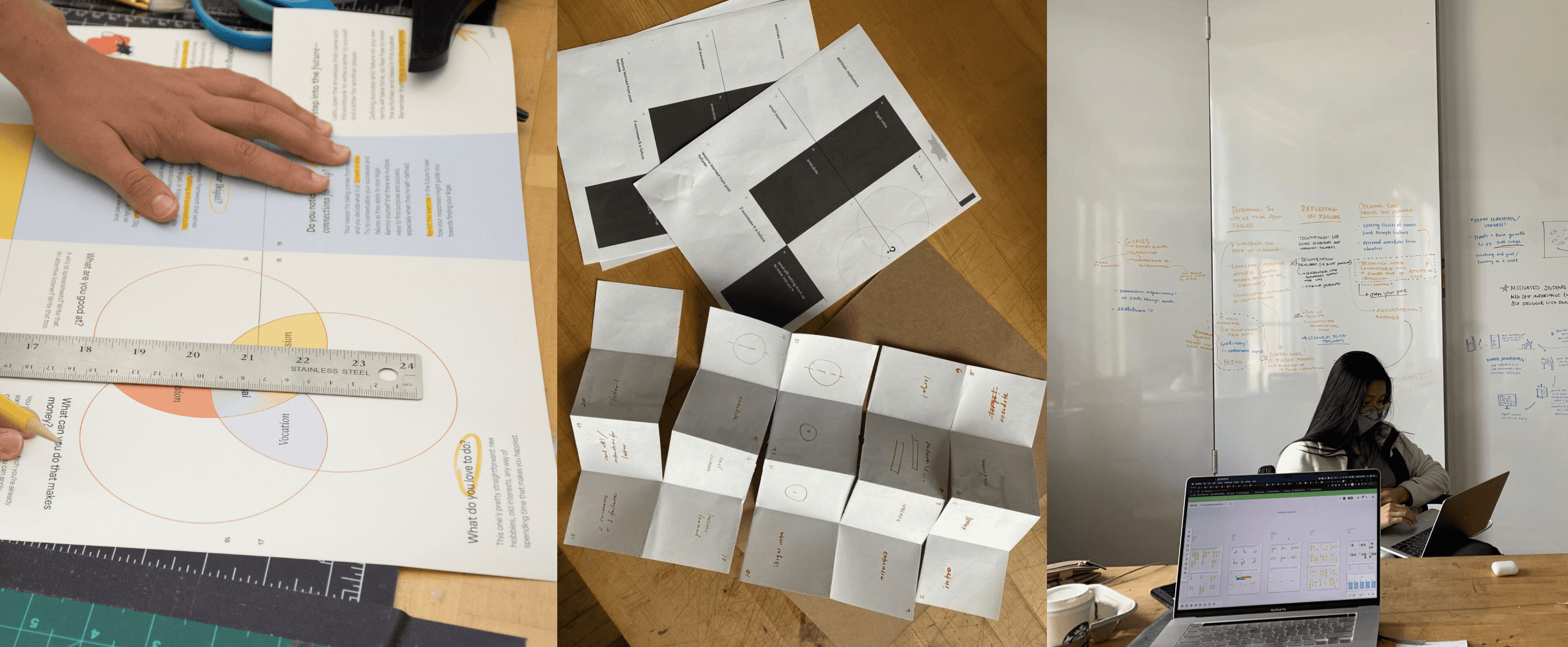
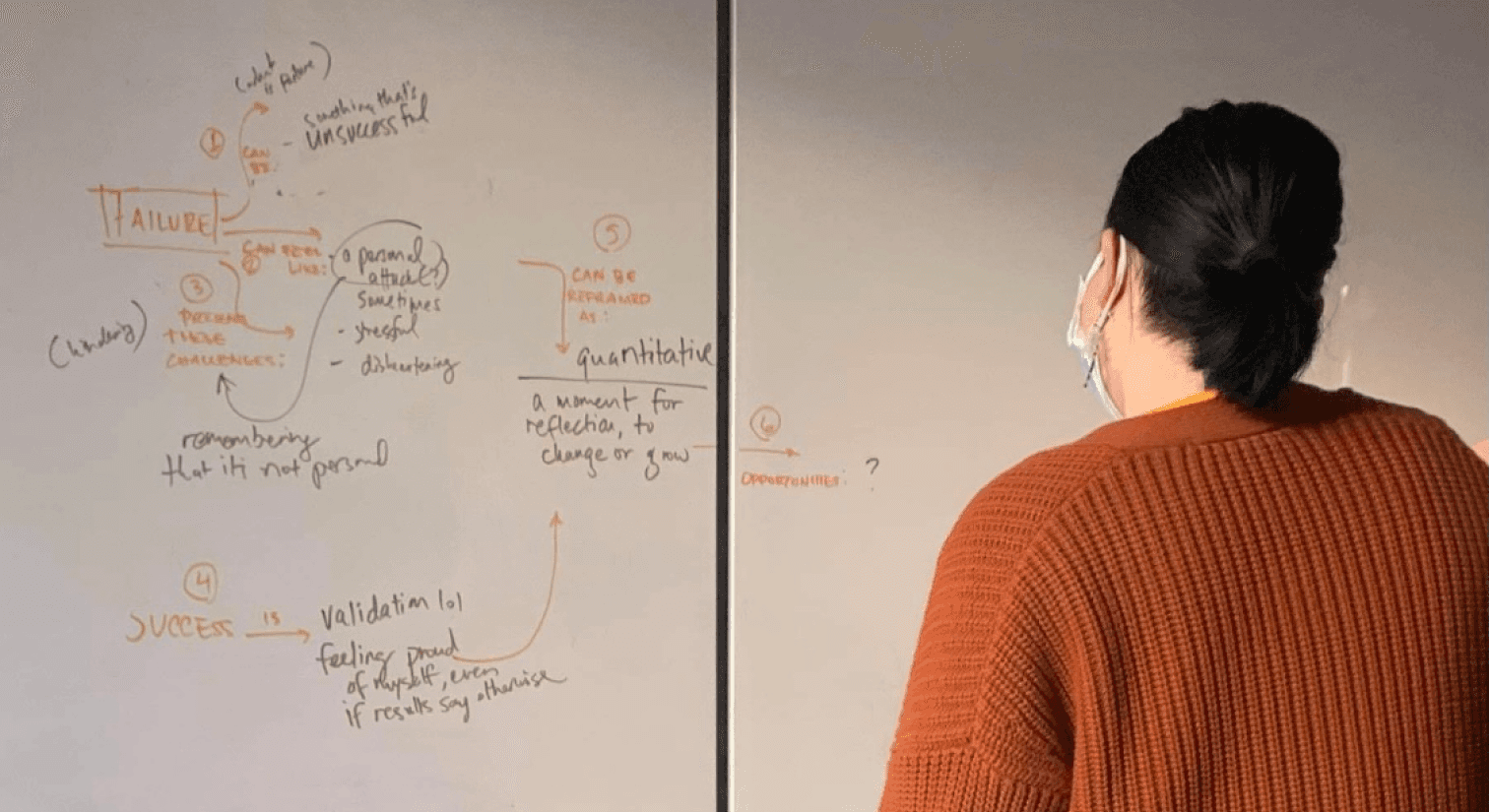
We conducted seven generative user research sessions to better understand people’s definitions of success and failure.
These students created personal concept maps to explore their individual definitions of success and failure. We gave them total freedom so that they could reframe these concepts and gain a deeper understanding of their meanings.
DESIGN APPROACH
Our aim was to employ temporal design in order to capture the natural full-circle moment we observed among our research participants.
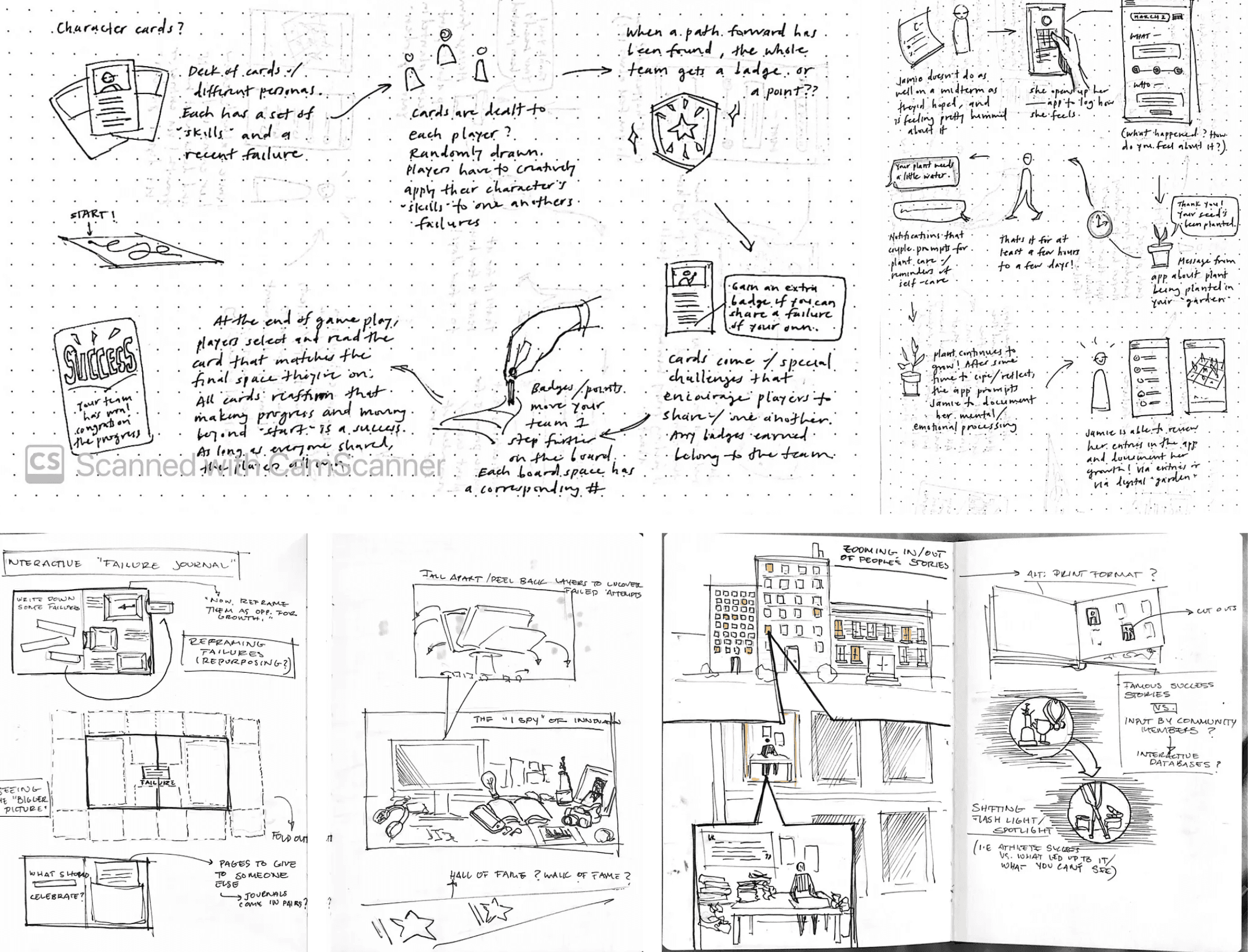
Our brainstorming included both visual and interactive methods for learner engagement and opportunities for learners to witness their growth over a condensed timeframe through connecting exercises and revisiting past concepts.
Curious about the other places we thought of pushing this learning experience? Feel free to reach out.
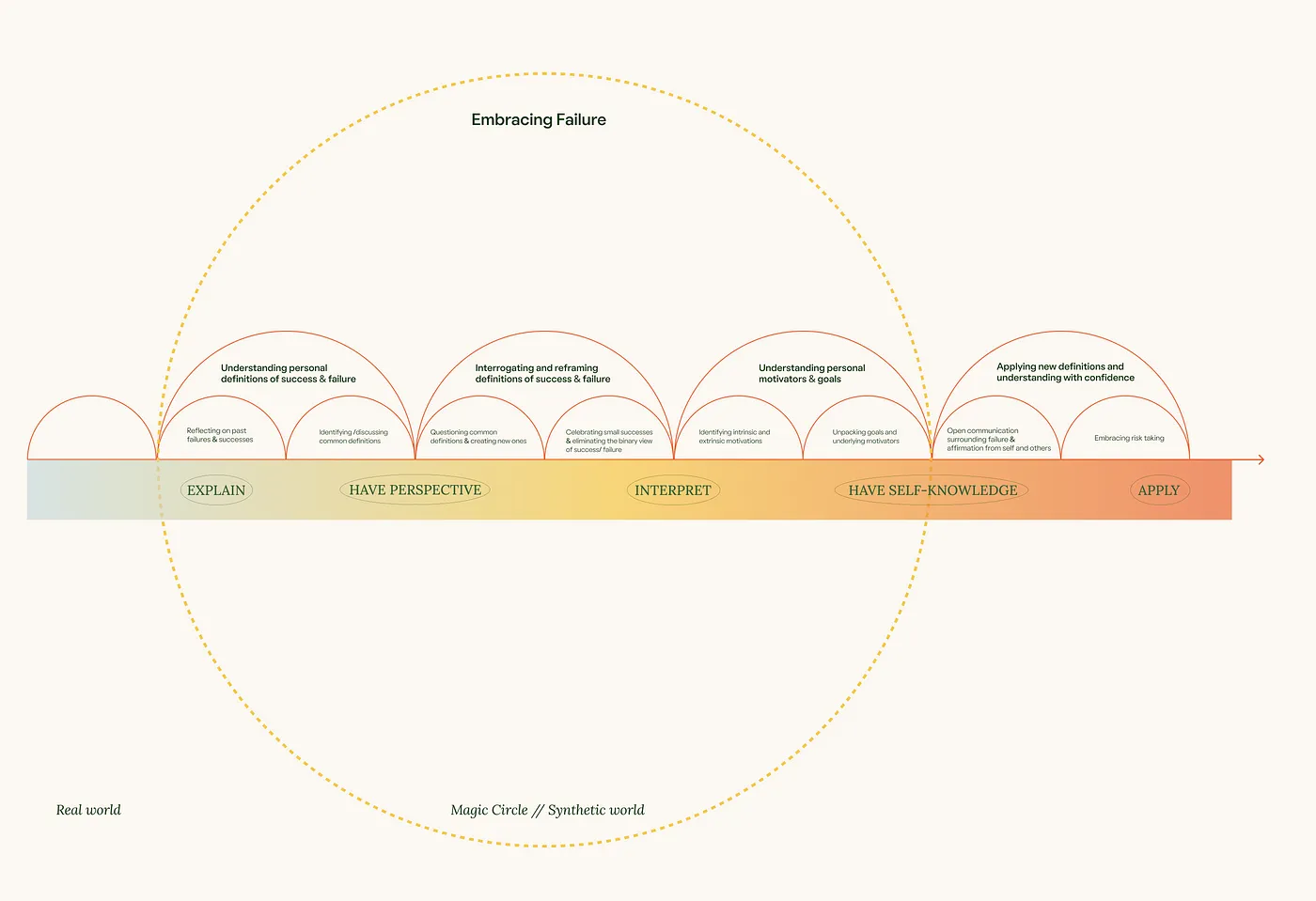
LEARNING FRAMEWORK
Two of the learning theories that became critical in our final design concept were Julie Dirksen’s Structured Flow of Goals diagram and Bernice McCarthy’s 4MAT System.
Using these two theories, we took a step back from our sketches and loose ideas in order to see the entire arc of the experience we aimed to create.
EVALUATION METHODS
We evaluated our concept and rough prototypes via a speed dating session with our peers.
Their feedback pointed us to the significance of striking a balance between new and challenging activities and more light hearted ones, being sure to avoid anything that might feel cliché or patronizing.
VISUAL DEVELOPMENT
With our idea approved, we moved onto developing the visual language and design system for the workbook.
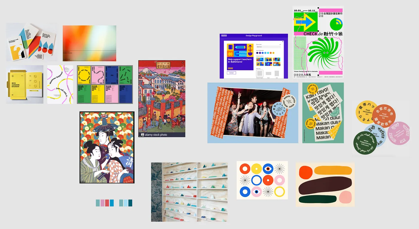
In crafting our visual language we were inspired by Japanese Ukiyo-e prints that typically feature a rich palette of hues including deep blues, vibrant greens, fiery reds, and soft pinks.
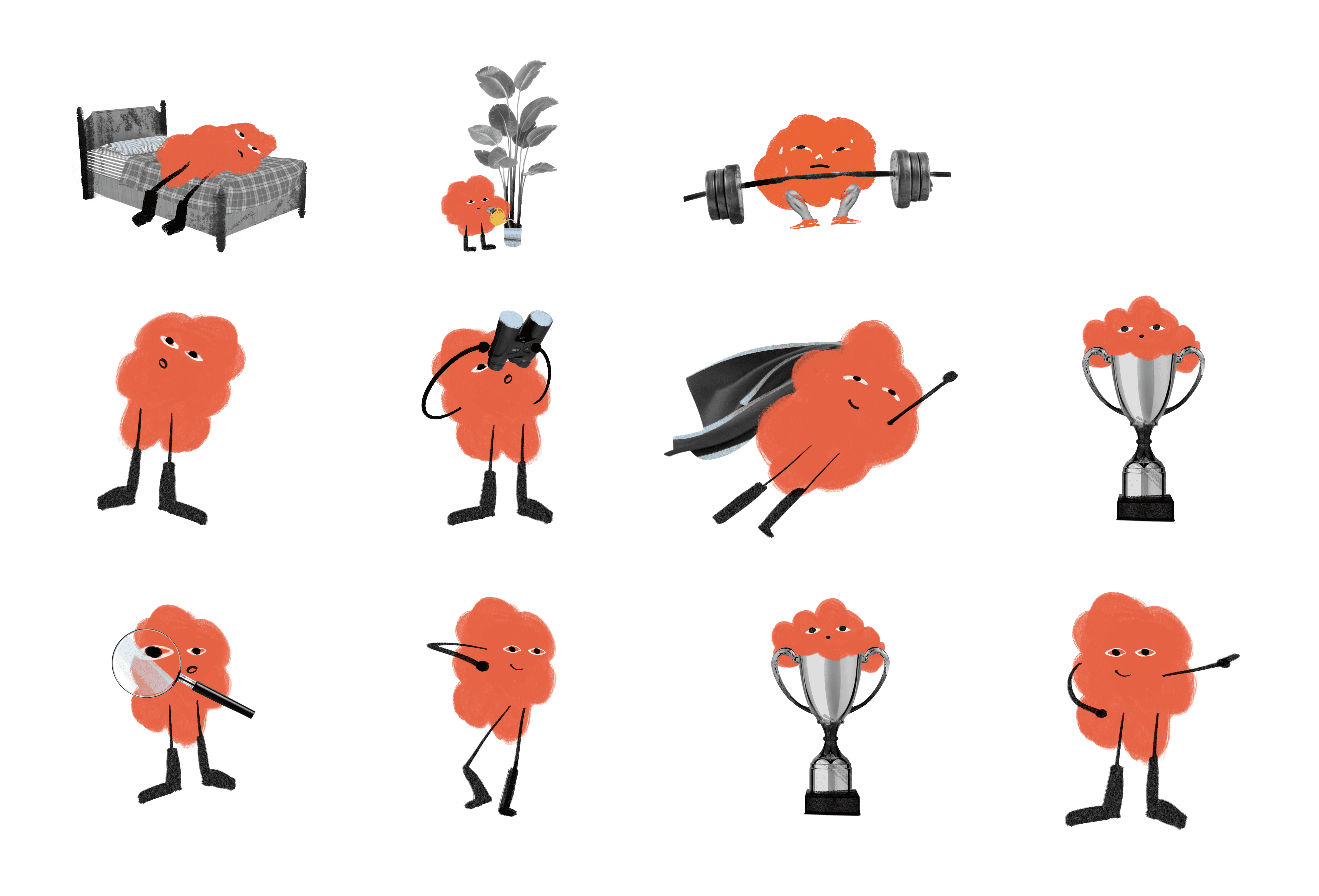
CHARACTER ITERATIONS
We worked on adding simple / fun characters that could draw people into the content.
The illustration style is fun but also grown up. It has a handmade feel and it’s expressive enough to convey human feelings and a lightheartedness. The illustrations act as little touches of joy throughout the workbook, to keep things feeling fresh. The character is designed to grow organically with context and environment - maintaining its consistency.
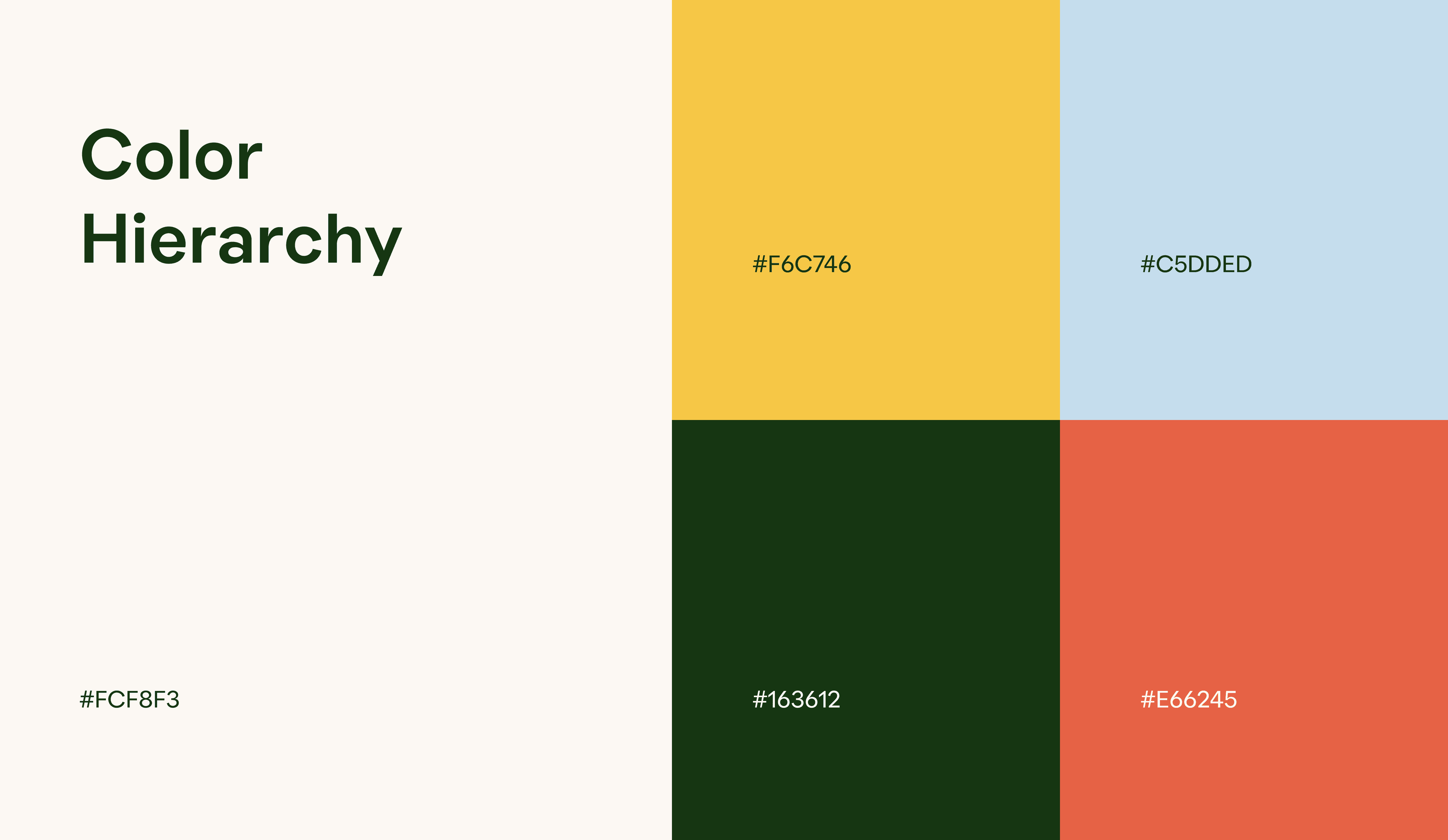
COLOR
Vivid hues were picked to complement the collaborative ethos we wished to convey.
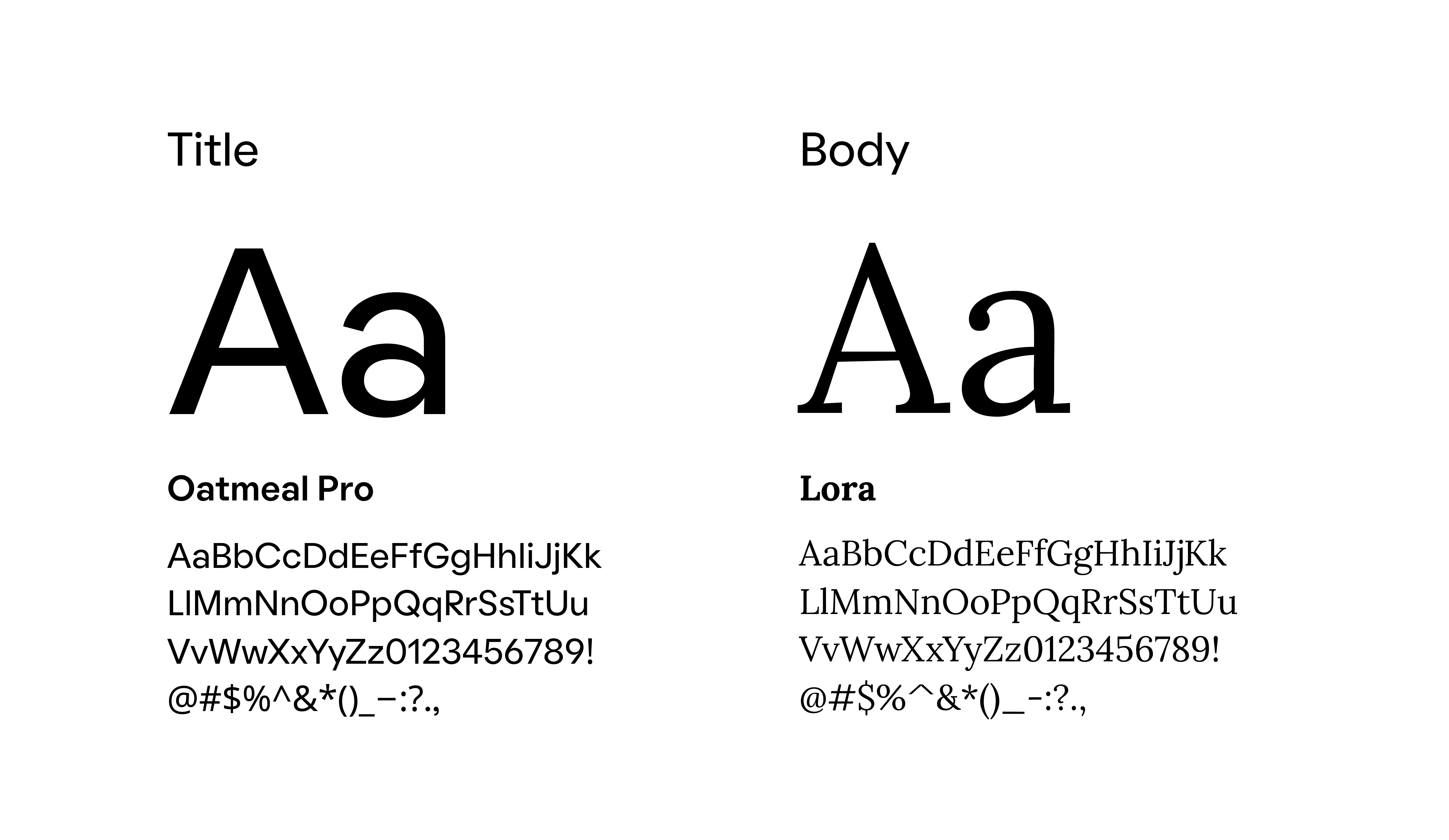
TYPOGRAPHY
Oatmeal Pro and Lora typefaces were carefully chosen to complement the colors and evoke a playful and comforting feel.
FINAL THOUGHTS
We failed a lot in the making of this book, and in doing so, we learned.
I enjoyed the unexpected experience of designing for learning. In this process, I gained a better understanding of the different design strategies and approaches that can help others understand complex concepts outside a traditional learning environment.